
Charts and Graphs in R
Tushar B. Kute,
http://tusharkute.com

•
•
•
•
•
•

•
•
!"
•
#
•
$%&
!'
•
#(
(

)*
•
#*+
pie(x, labels, radius, main, col, clockwise)
•
,!+
–
–
–
%
!+-.-&
–
–
–
'! !
'!'!

)/
# Create data for the graph.
x <- c(21, 62, 10, 53)
labels <- c("London", "New York", "Singapore",
"Mumbai")
# Give the chart file a name.
png(file = "city.png")
# Plot the chart.
pie(x,labels)
# Save the file.
dev.off()

)/

!
# Create data for the graph.
x <- c(21, 62, 10, 53)
labels <- c("Pune", "Nashik", "Aurangabad", "Mumbai")
# Give the chart file a name.
png(file = "city_title_colours.png")
# Plot the chart with title and rainbow color pallet.
pie(x, labels, main = "City pie chart", col =
rainbow(length(x)))
# Save the file.
dev.off()

!

!
# Create data for the graph.
x <- c(21, 62, 10,53)
labels <- c("London","New York","Singapore","Mumbai")
piepercent<- round(100*x/sum(x), 1)
png(file = "city_percentage_legends.png")
# Plot the chart.
pie(x, labels = piepercent, main = "City pie chart",col =
rainbow(length(x)))
legend("topright", c("Pune","Nashik","Aurangabad","Mumbai"),
cex = 0.8, fill = rainbow(length(x)))
# Save the file.
dev.off()

!

01
# Get the library.
library(plotrix)
# Create data for the graph.
x <- c(21, 62, 10,53)
lbl <- c("Nashik","Aurangabad","Navi Mumbai","Nagpur")
png(file = "3d_pie_chart.png")
# Plot the chart.
pie3D(x,labels = lbl,explode = 0.1, main = "Pie Chart of
Countries ")
dev.off()

01

•
!
•
%&
•
! 2
•
$
"

)*
•
#*+
barplot(H, xlab, ylab, main, names.arg, col)
•
,!+
–
–
–
**
–
–
–

)/
# Create the data for the chart.
H <- c(7,12,28,3,41)
# Give the chart file a name.
png(file = "barchart.png")
# Plot the bar chart.
barplot(H)
# Save the file.
dev.off()

)/

!
# Create the data for the chart.
H <- c(7,12,28,3,41)
M <- c("Mar","Apr","May","Jun","Jul")
# Give the chart file a name.
png(file = "barchart_months_revenue.png")
# Plot the bar chart.
barplot(H,names.arg = M,xlab = "Month",ylab =
"Revenue",col = "blue", main = "Revenue chart",border
= "red")
dev.off()

!

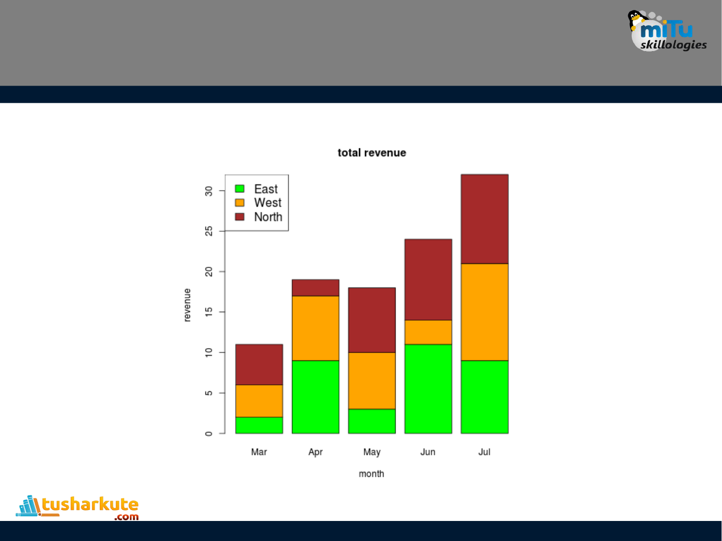
)'
colors <- c("green","orange","brown")
months <- c("Mar","Apr","May","Jun","Jul")
regions <- c("East","West","North")
Values <- matrix(c(2,9,3,11,9,4,8,7,3,12,5,2,8,10,11),nrow =
3,ncol = 5,byrow = TRUE)
png(file = "barchart_stacked.png")
barplot(Values,main = "total revenue",names.arg = months,xlab =
"month",ylab = "revenue", col = colors)
legend("topleft", regions, cex = 1.3, fill = colors)
dev.off()
)'

•
!!
•
$ 3#
(((
433
•
$
*!
•
*%&

)*
•
#*+
boxplot(x, data, notch, varwidth, names, main)
•
,!+
–
–
–
#5/!
–
! !!
2
–
!!
–

)/
•
677
8
'777*7
input <- mtcars[,c('mpg','cyl')]
print(head(input))

)/
# Give the chart file a name.
png(file = "boxplot.png")
# Plot the chart.
boxplot(mpg ~ cyl, data = mtcars, xlab =
"Number of Cylinders", ylab = "Miles
Per Gallon", main = "Mileage Data")
# Save the file.
dev.off()

)/

!
png(file = "boxplot_with_notch.png")
# Plot the chart.
boxplot(mpg ~ cyl, data = mtcars,
xlab = "Number of Cylinders",
ylab = "Miles Per Gallon",
main = "Mileage Data",
notch = TRUE,
varwidth = TRUE,
col = c("green","yellow","purple"),
names = c("High","Medium","Low")
)
dev.off()

!

•
3
'
•
"
•
/
•
%&#
'

)*
•
#*+
hist(v,main,xlab,xlim,ylim,breaks,col,border)
•
,!+
*
** *
'!

)/
# Create data for the graph.
v <- c(9,13,21,8,36,22,12,41,31,33,19)
# Give the chart file a name.
png(file = "histogram.png")
# Create the histogram.
hist(v,xlab = "Weight",col = "yellow",border = "blue")
# Save the file.
dev.off()
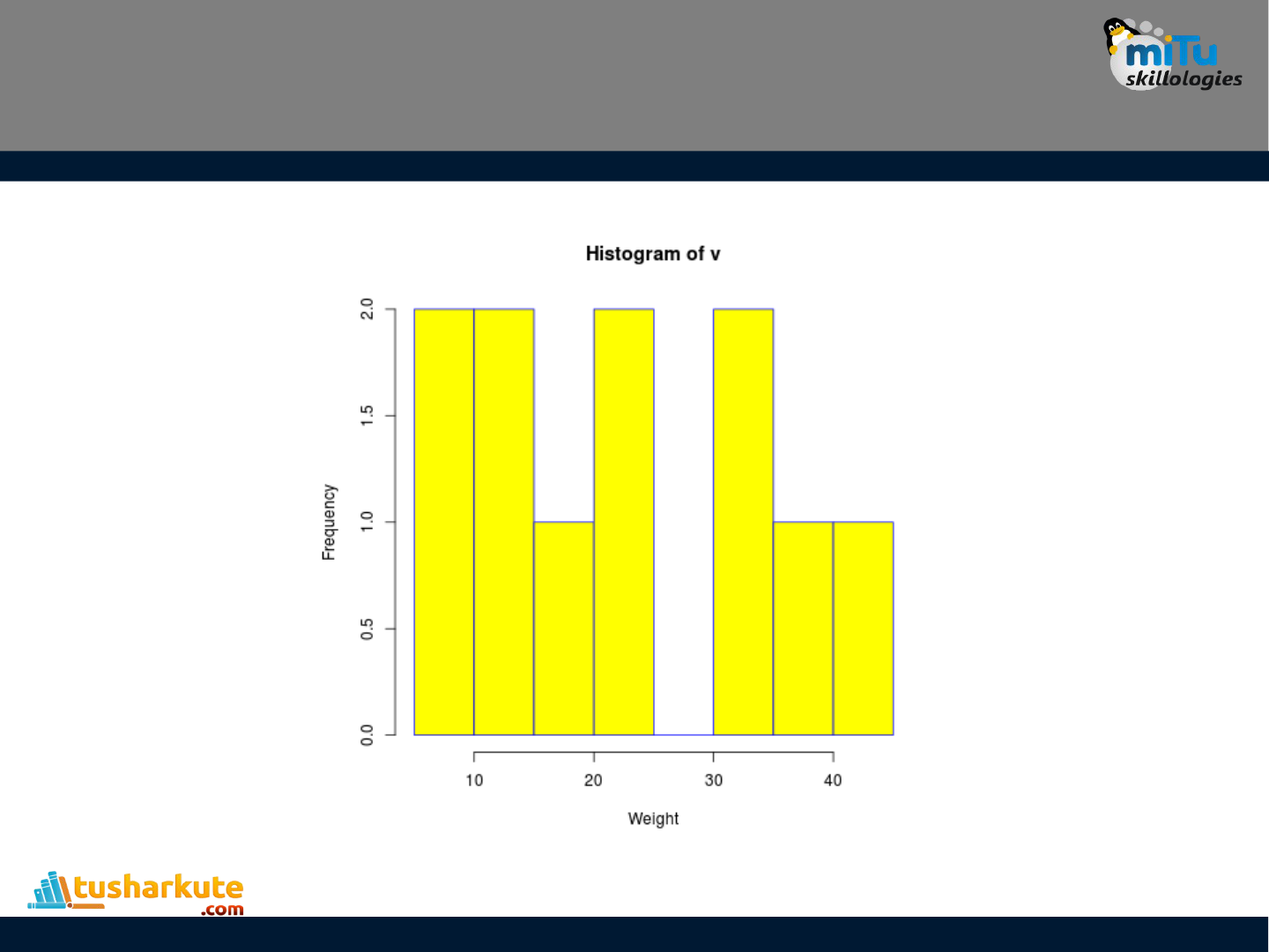
)/

)/
# Create data for the graph.
v <- c(9,13,21,8,36,22,12,41,31,33,19)
# Give the chart file a name.
png(file = "histogram_lim_breaks.png")
# Create the histogram.
hist(v,xlab = "Weight",col = "green",border =
"red", xlim = c(0,40), ylim = c(0,5), breaks = 5)
dev.off()

)/

•
*!!
•
#
%*&
•
**
•
#%&

)*
•
#*+
plot(v,type,col,xlab,ylab)
•
,!+
–
–
*' 77!*(77
!*77!
–
–
**
–
#
–

)/
# Create the data for the chart.
v <- c(7,12,28,3,41)
# Give the chart file a name.
png(file = "line_chart.png")
# Plot the line graph.
plot(v,type = "o")
# Save the file.
dev.off()
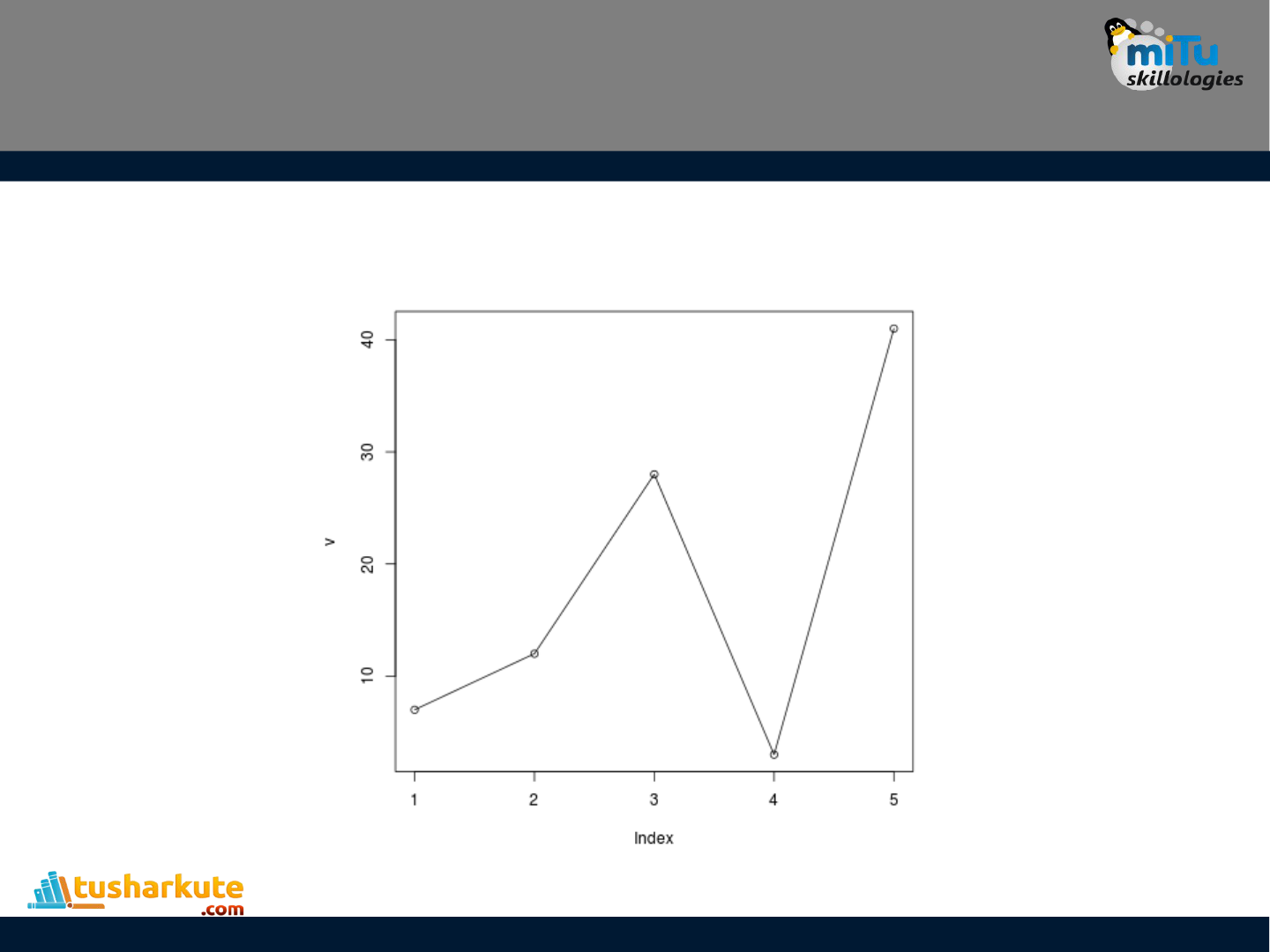
)/

)
# Create the data for the chart.
v <- c(7,12,28,3,41)
# Give the chart file a name.
png(file = "line_chart_label_colored.png")
# Plot the bar chart.
plot(v,type = "o", col = "red", xlab = "Month",
ylab = "Rain fall", main = "Rain fall chart")
# Save the file.
dev.off()

)

9
# Create the data for the chart.
v <- c(7,12,28,3,41)
t <- c(14,7,6,19,3)
# Give the chart file a name.
png(file = "line_chart_2_lines.png")
# Plot the bar chart.
plot(v,type = "o",col = "red", xlab = "Month", ylab = "Rain
fall", main = "Rain fall chart")
lines(t, type = "o", col = "blue")
dev.off()

9

•
!*
•
/ !
•
: 2
•
#
%&

)/
•
677
•
87!777
input <- mtcars[,c('wt','mpg')]
print(head(input))

)/
# Get the input values.
input <- mtcars[,c('wt','mpg')]
png(file = "scatterplot.png")
# Plot the chart for cars with weight between 2.5 to 5 and
mileage between 15 and 30.
plot(x = input$wt,y = input$mpg,
xlab = "Weight",
ylab = "Milage",
xlim = c(2.5,5),
ylim = c(15,30),
main = "Weight vs Milage"
)
dev.off()
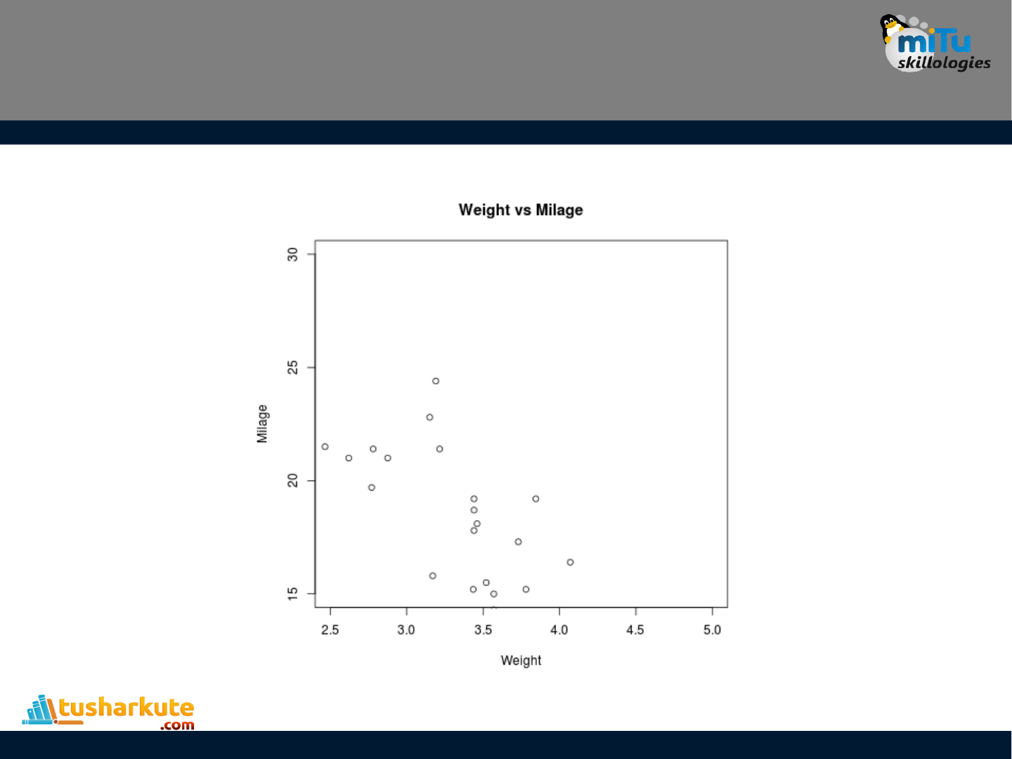
)/

•
6! ! !!
4!
!
•
6%&
–
*;
pairs(formula, data)
–
,!+
formula
data!
!'

)/
# Give the chart file a name.
png(file = "scatterplot_matrices.png")
# Plot the matrices between 4 variables giving 12
plots.
# One variable with 3 others and total 4 variables.
pairs(~wt+mpg+disp+cyl,data = mtcars,main =
"Scatterplot Matrix")
dev.off()

)/

5

