
USER GUIDE
MADCAP FLARE 2024
Tables
Copyright © 2024 MadCap Software.All rights reserved.
Information in this document is subject to change without notice. The software described in this document is furnished
under a license agreement or nondisclosure agreement. The software may be used or copied only in accordance with the
terms of those agreements. No part of this publication may be reproduced, stored in a retrieval system, or transmitted in
any form or any means electronic or mechanical, including photocopying and recording for any purpose other than the
purchaser's personal use without the written permission of MadCap Software.
MadCap Software
9171 Towne Center Drive, Suite 335
San Diego, California 92122
858-320-0387
www.madcapsoftware.com
THIS PDF WAS CREATED USING MADCAP FLARE.

CONTENTS
CHAPTER 1
Introduction 5
CHAPTER 2
General Information for Tables 7
Table Elements 8
Stylesheet and Formatting Options 10
CHAPTER 3
Main Activities for Tables 13
Inserting Tables 14
Editing Tables 24
Table Stylesheets 123
CHAPTER 4
Other Activities for Tables 151
Selecting Tables 152
Creating a List of Tables 158
Hiding and Showing Table Gridlines 160
Deleting Tables 161
CONTENTS
iii


CHAPTER 1
Introduction
Supported In:
A table in Flare is much like it is in any word processing program, such as Microsoft Word, or in a
printed textbook. It is a group of intersecting columns and rows that you can add to a topic for
various purposes, such as comparing different elements.
General Information
n
"Table Elements" on page 8
n
"Stylesheet and Formatting Options" on page 10
Main Activities
n
"Inserting Tables" on page 14
n
"Editing Tables" on page 24
n
"Table Stylesheets" on page 123
l
"Creating Table Stylesheets" on page 126
l
"Editing Table Stylesheets" on page 130
l
"Applying Table Stylesheets to Tables" on page 145
CHAPTER 1
5


Table Elements
Following are explanations of some of the basic elements involved with tables.
Caption A caption is a small title or description that you can add either above or below
the table. Using a caption above a table helps with accessibility.
Column A column is a series of vertical cells in a table. For example, this table contains
two columns—one starting with the heading text "Element/Feature" and the
other starting with the heading text "Description."
Row A row is a series of horizontal cells in a table. For example, this table contains
numerous rows. The second row in this table consists of the cell with the text
"Caption" and the cell to the right with the description for that term. The third
row consists of the cell with the text "Column" and the cell to the right with the
description for that term.
Cell A cell is a single rectangular or square area within a table, where you can add
text and other content. Each cell has its own set of gridlines that separate it
from the other cells in the table. For example, the paragraph you are reading is
contained in one cell.
Header Row A header row is the first series of horizontal cells in a table. A header row is
used to provide explanatory phrases for each of the columns in the table. For
example, this table contains a header row; the first cell of the header row in this
table contains the text "Element/Feature," and the second cell of the header row
in this table contains the text "Description." Including a header row is optional.
Using a header row helps with accessibility.
Footer Row A footer row is the final series of horizontal cells in a table. A footer row is used
to provide footnotes pertaining to the table and its content. This table does not
contain a footer row. Including a footer row is optional.
CHAPTER 2
8

Gridlines Gridlines are the gray lines that indicate the edges of cells in a table. They
appear in the XML Editor so that you can distinguish where rows, columns, and
cells are located. Gridlines do not appear in the final output unless you add
borders to the table. By default, when you add a table to a topic, the gridlines are
shown in the XML Editor lets you easily hide or show the gridlines as necessary.
Table Style
Template
A table style template is simply a table style that has already been designed.
When you create a new table style, you can use a table style template so that it
already has a design to get you started.
CHAPTER 2
9

Stylesheet and Formatting Options
You can control the look of tables in the following ways:
n
Branding Stylesheet This lets you define your project's look and feel for branding purposes,
including tables. If you create your project with Start New Project Wizard, the CSS variables
are automatically linked to various places throughout the project where they point to the
branding stylesheet.
n
Regular Stylesheet This lets you store styles for general content in your project, including
tables, to control how that content looks. See "Editing Table Styles in Regular Stylesheets" on
page 25.For more information about regular stylesheets, see the online Help.
n
Table Stylesheet This lets you control the look for tables only, creating customizable patterns.
See "Table Stylesheets" on page 123 and "Editing Table Stylesheets" on page 130.
n
Table Properties Dialog This lets you control the look for a specific table only, by setting
options locally. See "Editing Table Properties" on page 115.
n
Other Local Formatting Tools For virtually any kind of content that you add to a content file
(e.g., topic, snippet), there are a variety of local formatting tools to control the look. For
example, you can highlight text in a table and use the Home ribbon to change the color. For
more information see the Flare online Help.
Which Should I Use?
Using a stylesheet is always preferred over local formatting (i.e., controlling the look of content only
at the place where it has been inserted). The good thing about stylesheets is that they let you
separate the presentation from the content. That way, you can manage the look from one place,
which can save you a lot of time and effort. For example, you can change the padding in 84 tables
by changing a setting in a single stylesheet, as opposed to opening each of those 84 tables and
changing the padding in each one. Of course, there may be times when you need to make a change
in the properties for a single table only, but for the most part, you should try to use stylesheets.
So why are there two kinds of stylesheets for tables? Why do you need to use a table stylesheet
when you've already got a regular stylesheet? You actually do not need to. You can produce a look
for tables entirely by using a regular stylesheet. But if you want to create many different table
designs, and tables that have different patterns (e.g., every other row might have a green
background), it can be very difficult to do this in a regular stylesheet. So Flare lets you use these
special table stylesheets to accomplish this task much more easily. You might even use both types
of stylesheets to control different aspects of your tables.
CHAPTER 2
10

CHAPTER 2
11

What About Conflicts and Precedence?
Because you can often control the look of a table in multiple ways—(1) local formatting tools, (2)
local table properties, (3) a table stylesheet, (4) a regular stylesheet, or (5) branding stylesheet—it's
possible that you might encounter conflicting settings from time to time. When this happens, the
settings closest to the content typically has precedence. So precedence works like this: Local
Formatting > Table Stylesheet > Regular Stylesheet > Branding Stylesheet.
EXAMPLE You open a regular stylesheet and specify that the outer borders of the table
should be green. Then you open the table stylesheet and specify that the outer borders
should be red. And then you open the Table Properties dialog and specify that the outer
borders should be blue. You've told Flare to do three different things to the same table. So
in this case, the table would display blue borders, because the local properties rule over the
other settings. But if you remove that setting from the Table Properties dialog and use the
default setting, the table would then display red borders, because the table stylesheet has
precedence over the regular stylesheet. And finally, if you remove the settings from both
the Table Properties dialog and table stylesheet, using the default setting in both, the table
would take its command from the regular stylesheet and display green borders.
CHAPTER 2
12


Inserting Tables
You can create a table using the Insert Table dialog, which lets you specify various properties and
settings for the table while you create it. Another option is to use the Insert Table grid, which lets
you create a simple table by quickly selecting squares displayed from the Insert Table button; this
method is faster but does not let you specify properties and settings for the table at the point of
creation.
CHAPTER 3
14

How to Create a Table Using the Insert Table
Dialog
1. In the XML Editor place your cursor where you want to add the table.
2. Select Table > Insert Table (face of the button). The Insert Table dialog opens.
3. Select the General tab and modify the options as necessary.
TABLE SIZE
n
Number of columns Enter the number of columns for the table.
n
Number of rows Enter the number of rows for the table.
n
Number of header rows Enter the number of header rows for the table. A header row
can be used to hold titles for the different columns in the table. These rows are
automatically repeated at the top of pages in print-based output when a table covers
more than one page.
n
Number of footer rows Enter the number of footer rows for the table. A footer row can
be used to hold footnote information about the table.
TABLE CAPTION
n
Text Enter a caption (or title) for the table.
n
Side Click in this field and select to place the caption either above or below the table.
NOTE Different browsers display different results if you have all of the
following set on a table: a caption, rounded borders, and a color in the
background of the first row. That's because some browsers consider the
caption part of the table and others do not. One possible workaround is to set
the border-top-left-radius and border-top-right-radius on the top-left and top-
right cells.
CHAPTER 3
15

n
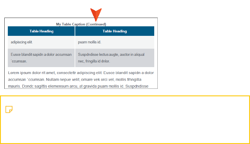
RepeatIf you want captions to repeat on tables that span multiple pages in print-based
output, select Repeat from this field.
NOTE You can also edit this option in the regular stylesheet using the mc-
caption-repeat property.
In addition, you can edit table cell properties in the regular stylesheet.
CHAPTER 3
16
n
Continuation In this field, you can enter continuation text to the end of captions that
repeat (other than the caption appearing on the first page where a table occurs).
Typically this text would be something like "(continued)."
NOTE You can also edit this option in the regular stylesheet using the mc-
caption-continuation property.
In addition, you can edit table cell properties in the regular stylesheet.
SUMMARY
You can enter a summary for a table. This adds the "summary" attribute to the <table> tag
and is used to help make your output more accessible to individuals with disabilities.
AUTOFIT BEHAVIOR
n
AutoFit to contents Automatically sets the column widths to the same width as the
table content.
n
AutoFit to window Automatically sets the table width to the same width as the output
window.
n
Fixed column width Sets the column widths to the width that you specify. Select the
down arrow next to this field and set the width in the popup.
ALIGN
Aligns the entire table either to the left, right, or center of the topic.
CHAPTER 3
17
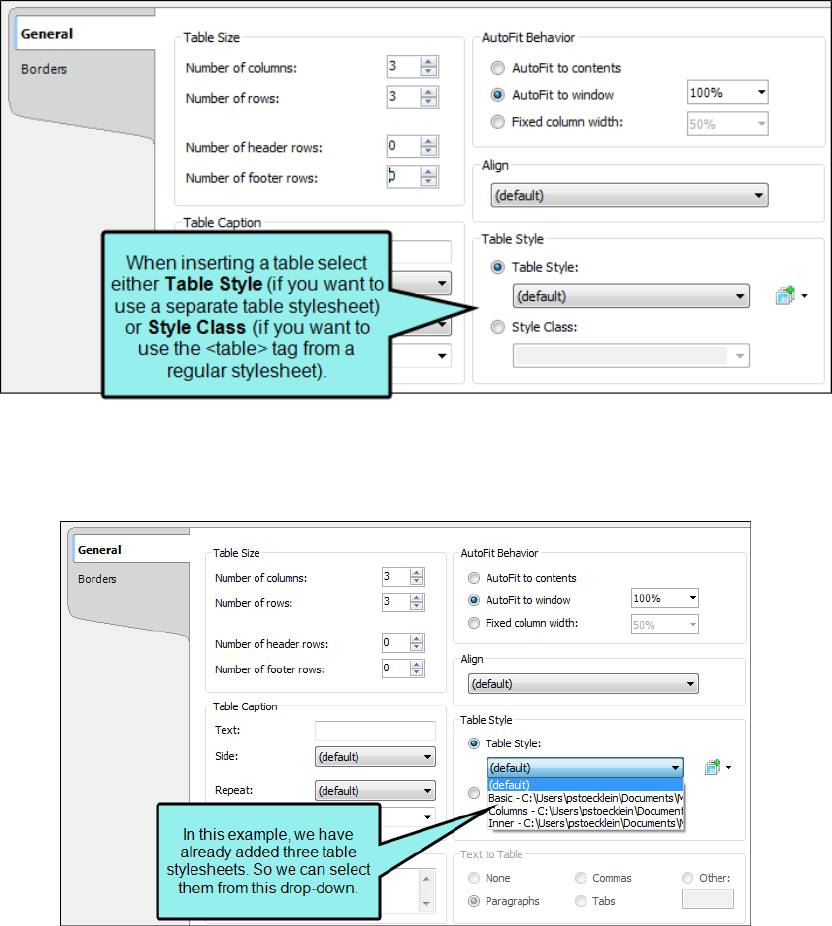
TABLE STYLE
You can select to use either a special table stylesheet or the table style from a regular
stylesheet. Whichever one you choose will control the look of the table that you insert. When
you add a table stylesheet to your project, it is stored in the Resources > TableStyles
subfolder in the Content Explorer.
n
Table Style Select this option if you want to use a table stylesheet to control the look of
the table. You can then select an existing table stylesheet from the drop-down list.
CHAPTER 3
18

n
If you do not yet have a table stylesheet that you want to use, click the face of this
button to open the Select Table Style Template dialog. This lets you create new table
stylesheet. If you click the down arrow next to the button, you can select Print Style.
This opens the Select Table Style dialog, which you can use to specify another table
style to be used specifically for printed output. However, it is recommended that you
use a medium instead of the "Print Style" option.
CHAPTER 3
19

n
Style Class Select this option if you want to use a regular stylesheet to control the look
of the table. You can then select the main table style from the drop-down, or you can
select any class that you have added under that style. You can create classes for the
table style in the Stylesheet Editor; those classes will then become available in this
drop-down field.
TO ADD A TABLE STYLE TO THE INSERT TABLE DIALOG
a.
In the Insert Table dialog, the face of the Create New Table Style button , not the
down arrow. The Select Table Style Template dialog opens.
b. In the Template Folders area, select a folder.
c. In the Templates area, select one of the templates from the folder. You can see a
preview of how the table will look in the Preview area below.
d. (Optional) You can type a new name in the New Style Name field.
e. Click OK. The style is added to the Insert Table dialog.
CHAPTER 3
20
TEXT TO TABLE
These options are enabled if you have selected text before opening the dialog to insert the
table. This lets you create the table and quickly place all of the selected text into table cells.
n
None Creates a table but does not include any of the selected text (i.e., text is removed
and replaced with new table).
n
Paragraphs Converts multiple paragraphs to a table (each paragraph placed in a
separate table cell).
n
Commas Converts text separated by commas to a table (each segment of text between
a comma placed in a separate table cell).
n
Tabs Converts text separated by tabs to a table (each segment of text between a tab
separator placed in a separate table cell).
n
Other Converts text separated by a specific text string (e.g., semicolons) to a table.
After selecting this option, enter that text string in the field to the right. Each segment
of text between the text string that you specify will be placed in a separate table cell.
4. Select the Borders tab and modify the options as necessary.
n
Outer Borders Click in any of the individual fields (Left, Right, Top, Bottom) to specify
the settings for the table border. If you click the down arrow to the right of all the fields,
the settings will be applied to all of the border fields. When you click the down arrow or
in one of the individual fields, a small popup displays. Use the lower-left area of the
popup to enter a number for the thickness of the border. Use the lower-middle area to
select a unit of measurement (e.g., point, pixel, centimeter) for the number you entered.
Use the upper-right area to select a color for the border. And use the lower-right area to
select a line type (e.g., solid, double, dashed) for the border. When you are finished, click
OK in the small popup.
CHAPTER 3
21

n
Border Radius These fields let you create rounded corners on the table. Click in any of
the individual fields (Top-Left, Top-Right, Bottom-Right, Bottom-Left) to specify the
settings for a particular corner of the table. If you click the down arrow to the right of all
the fields, the settings will be applied to all of the fields.When you click that down
arrow or in one of the individual fields, a small popup displays. This popup has two
halves. You can complete only the left side of the popup if you like. This will create a
curve that is equal horizontally and vertically. If you want a border to have more of a
curve either horizontally or vertically, you can complete the fields in the right half of the
popup as well, so that you have two values (e.g., 10px 15px) instead of one. For more
information on using two sets of border radius properties, see
css3.info/preview/rounded-border/. Use the lower-left area of the popup to enter a
number for the amount of curve. The greater the number, the more curve that is
applied.Use the area to the right of the number field to select a unit of measurement
(e.g., point, pixel, centimeter). If you want to provide a second value for the rounded
border, complete the same fields on the right half of the popup. When you are finished,
click OK in the small popup.
n
Cell Border Collapse Select whether you want to collapse the cell borders in the table. If
you collapse the cell borders, the row and cell borders of a table are joined in a single
border. If you do not collapse the cell borders, the row and cell borders of a table are
detached. If you use the border radius properties to create rounded borders, this must
be set to "Do not collapse cell borders."
n
Cell Border Spacing Use to increase or decrease the cell border spacing (in pixels).
5. Click OK. The table is added. Now you can click in any cells of the table and add content (e.g.,
text, images, hyperlinks) as necessary.
6.
Click to save your work.
CHAPTER 3
22

How to Create a Table Using the Insert Table
Grid
1. In the XML Editor place your cursor where you want to add the table.
2. Select Table > Insert Table (down arrow).
3. Hover over the grid. When you do this, the squares change color to indicate how many rows
and columns will be included in the table. As soon as you click, the new table is inserted.
The table initially looks very plain because it has no properties or stylesheet associated with
it. Therefore, you will likely want to open the Table Properties dialog at some point to specify
settings and/or apply a table stylesheet to it. See "Editing Tables" on the next page and
"Editing Table Properties" on page 115.
4.
Click to save your work.
What’s Noteworthy?
NOTE When you insert a table, it is set up by default to use standard table tags in the
individual cells (e.g., <th> for table headers, <td> for regular table text). However, if you
press ENTER at the end of a line, a <p> tag is added within the standard tag. Therefore, in
order to keep all of the content in your table cells looking consistent, there are a couple of
things you can do. First, if you are editing table styles in a regular stylesheet, you can create
advanced selectors (e.g., "td p"). Second, you may want to create a special style class of the
p style to be used for table content (e.g., p.tabletext) and apply that style to all of your cells
when you first create a table. You can manually apply specific styles to tables by selecting
the table cells, clicking Table > Cell Content Style, and choosing the style to be used for
those cells.However, rather than repeating all these steps each time you create a table, the
easiest way to accomplish this is to set a default cell content style. You can do this in a
couple of ways: globally or using a table stylesheet. See "Editing Table Styles in Regular
Stylesheets" on page 25, "Selecting Styles for Table Cell Contents" on page 63, and "Editing
Table Stylesheets" on page 130.
CHAPTER 3
23

Editing Tables
In addition to simply clicking in cells and typing text, there are several ways that you can edit tables
after inserting them.
n
Branding Stylesheets You can modify the look and feel of branding elements in your project,
including tables, using the branding stylesheet. You can also select CSS variables in the Table
Style Editor that point to the Branding.css file.
n
Regular Stylesheets You can modify the look and feel of multiple tables at once by editing
standard HTML table styles (e.g., table, th, td, tr) in your regular stylesheet. For example, you
might use these styles in order to control the look of the text that appears in your table
headings (th style) or within the cells (td style). See "Editing Table Styles in Regular
Stylesheets" on the next page.
n
Table Stylesheets You can modify the look and feel of multiple tables at once by editing the
properties in a custom table stylesheet. These table stylesheets let you easily and quickly
create patterns and different looks for tables. See "Editing Table Stylesheets" on page 130.
NOTE For the differences between branding stylesheets, regular stylesheets, table
stylesheets, and local properties—and when you should use one over the other—see
"Stylesheet and Formatting Options" on page 10
WARNING When controlling the look of tables, be aware of conflicts that can arise
when you are using standard table styles (e.g., tr, td) from a regular stylesheet and
you are also inserting proxies in the project. For example, if you set the text-indent
property on the td style, it could affect the indentation of a generated table of
contents or mini-toc.
CHAPTER 3
24

Editing Table Styles in Regular Stylesheets
Supported In:
You can modify the look and feel of multiple tables at once by editing standard HTML table styles
(e.g., table, th, td, tr) in your regular stylesheet. For example, you might use these styles in order to
control the look of the text that appears in your table headings (th style) or within the cells (td style).
How to Edit Table Styles in a Regular Stylesheet
1. From the Content Explorer, open the stylesheet that you want to modify.
2.
In the local toolbar, make sure the first button displays . If the button displays
instead, then click it.
NOTE For steps using the Simplified view, see the online Help.
3. In the upper-left corner of the editor, click in the drop-down field and select
.
4. From the area below, select the appropriate table style.
n
caption Modifies the table caption, which is a short title or description of the table's
purpose. When inserting or editing a table, you can add a caption above or below the
table.
n
col Groups together attribute specifications for table columns. The <col> elements are
empty and serve only as a support for attributes. They may appear inside or outside an
explicit column group (i.e., <colgroup> element).
n
colgroup Groups columns together structurally. The number of columns in the column
group may be specified by using the element's <span> tag or by the <col> element,
which represents one or more columns in the group.
CHAPTER 3
25

n
table Modifies an entire table. It contains all other elements that specify caption, rows,
content, and formatting.
n
tbody Modifies the main rows in a table (i.e., not the header or footer rows). Each
<tbody> tag must have at least one <tr> tag within it, which is used to represent a single
row.
n
td Modifies the data (or content) in the primary cells of a table. When you press ENTER
after the first paragraph in a table cell, a paragraph <p> tag is added inside each <td>
tag in that cell.
n
tfoot Modifies a footer row in a table. When a table requires multiple pages in print
layouts and outputs, the footer row is placed at the bottom of the last page. Each
<tfoot> tag must have at least one <tr> tag within it, which is used to represent a single
row.
n
th Modifies the header content in a table. Why not just use the <td> tag for header
content as well? First, by having different tags, you can more easily dictate one look for
the header text (e.g., bold font) and a different look for the main content in the table
(e.g., normal font). Second, using separate tags greatly assists users with visual
disabilities, making it possible for multi-modal wireless browsers with limited display
capabilities (e.g., Web-enabled pagers and phones) to handle tables. When you press
ENTER after the first paragraph in a table cell, a paragraph <p> tag is added inside each
<th> tag in that cell.
n
thead Modifies a header row in a table. When a table requires multiple pages in output,
the header row is repeated by default at the top of each page. Each <thead> tag must
have at least one <tr> tag within it, which is used to represent a single row.
n
tr Modifies single rows that are contained within <tbody>, <tfoot>, and <thead> tags.
For more about each of these tags, please refer to http://www.w3c.org.
5. From the Show drop-down list on the upper-right side of the editor, select
. The most relevant properties for that style are shown on the
right side of the editor.
6. (Optional) You can use the toggle button in the local toolbar to show properties below in a
group view or an alphabetical view .
CHAPTER 3
26

7. Locate the property you want to change.
Most of the relevant properties are the same as those used for regular paragraph formatting.
For details about using the features on these tabs, see the online Help.
8. The area to the right of the property is used for selecting and entering values.If you know
how to enter the information correctly, you can click in the value field and type it
directly.Otherwise, click the ellipsis button to the right of the property.Depending on the
type of property, the appropriate controls and options display, allowing you to choose or enter
values (e.g., select from a drop-down list, click a button, complete fields in a dialog or
popup).If you completed values in a popup, click OK at the bottom of the box.
For example, you might want to adjust the vertical alignment of text (e.g., top, middle, bottom)
in the td and th styles. You can do this by expanding the Cell property group and setting the
vertical-align property.
9.
Click to save your work.
How to Create Advanced Selectors for Table Styles
When you insert a table, it is set up by default to use standard table tags in the individual cells (e.g.,
<th> for table headers, <td> for regular table text). However, if you press ENTER at the end of a line,
a <p> tag is added within the standard tag. Therefore, in order to keep all of the content in your table
cells looking consistent, there are a couple of things you can do. First, if you are editing table styles
in a regular stylesheet, you can create advanced selectors (e.g., "td p"). Second, you may want to
create a special style class of the p style to be used for table content (e.g., p.tabletext) and apply
that style to all of your cells when you first create a table. You can manually apply specific styles to
tables by selecting the table cells, clicking Table > Cell Content Style, and choosing the style to be
used for those cells.
Following are steps for using advanced selectors in a regular stylesheet. For details on using the
Cell Content Style feature, see "Selecting Styles for Table Cell Contents" on page 63.
NOTE For most projects, using an advanced selector in a regular stylesheet is probably the
best method to control the look of table cell content. Just use it with caution because it will
affect all paragraph tags in all tables. If you want to have a different default look for
paragraph content depending on the table, it might be better to use the cell content style.
CHAPTER 3
27

1. In the local toolbar of the Stylesheet Editor, click Add Selector.
2. In the dialog, click in the HTML Element field and enter a table style (e.g., td, th). Then click the
Advanced Options down arrow to show more fields.
3. In the Advanced Selector field, add a space after the table style, then type p (e.g., td p).
This is a special style where you are telling Flare that when it finds a <p> tag within a table tag
(e.g., <td>), you want it to look a certain way.
4. Click OK.
5. Filter the Stylesheet Editor to show All Styles, and at the top of the list of styles, expand
(Complex Selectors).
CHAPTER 3
28

6. Under (Complex Selectors), scroll down and select your advanced selector (e.g., td p). Then
set properties for it on the right side of the editor. You probably want to set the same
properties that you set on the main table style. For example, if you set a font size of 12pt on
the td style to control content in regular body cells of a table, you likely want to set the same
font size on a "td p" advanced selector.
7.
Click to save your work.
CHAPTER 3
29

Hiding the Bottom Border on Tables When
Crossing Page Breaks
Supported In:
By default, if you have a table that crosses multiple pages in print-based output, the bottom border
is shown before the table continues on the next page.
CHAPTER 3
30

However, you also have the option to hide the bottom border when the table continues on another
page.
CHAPTER 3
31

How to Hide Table Bottom Borders in a Regular
Stylesheet
1. From the Content Explorer, open the stylesheet that you want to modify.
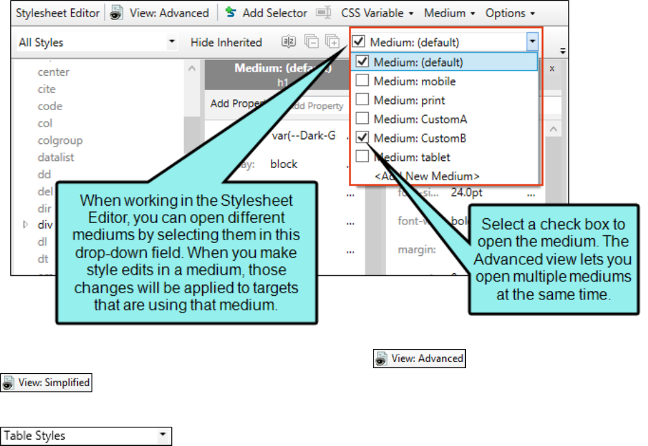
2. From the Medium drop-down in the Stylesheet Editor, make sure the proper medium is
selected before you begin. In the Advanced view, you can open multiple mediums at once;
you just need to look at the title at the top of the medium pane and make sure you are
working in the correct one. If you are not using stylesheet mediums for your different outputs
or if you want all mediums to have the same settings, just leave the medium set to default
and continue.
Please note that Flare remembers the last medium that you used when working in the
stylesheet, so it may or may not be the one that you want to use the next time around.
3.
In the local toolbar, make sure the first button displays . If the button displays
instead, then click it.
4. In the upper-left corner of the editor, click in the drop-down field and select
.
5. On the left side of the editor, select the table style.
6. From the Show drop-down list on the upper-right side of the editor, select
. The most relevant properties for that style are shown on the
right side of the editor.
7. (Optional) You can use the toggle button in the local toolbar to show properties below in a
group view or an alphabetical view .
8. If you are using the group view, expand the Table group.
CHAPTER 3
32

9. To the right of mc-hide-bottom-ruling, click , and select true.
10.
Click to save your work.
CHAPTER 3
33

How to Hide Table Bottom Borders in a Table
Stylesheet
1. From the Content Explorer, open the stylesheet that you want to modify.
2. In the Table Style Editor, select the General tab.
3. Toward the bottom of the tab, click the field labeled Hide bottom ruling when table crosses a
page break, and select True.
4.
Click to save your work.
CHAPTER 3
34

How to Hide Table Bottom Borders Locally in the
Properties Dialog
1. Open the content file.
2. Click inside the table.
3. Do one of the following, depending on the part of the user interface you are using:
n
Ribbon Select Table > Table Properties.
n
Right-Click Right-click the table and from the context menu, select Table Properties.
4. Select the Borders tab.
5. Click the field labeled Hide bottom ruling when table crosses a page break, and select True.
6. Click OK.
7.
Click to save your work.
CHAPTER 3
35

What’s Noteworthy?
NOTE Because you can often control the look of a table in multiple ways—(1) local
formatting tools, (2) local table properties, (3) a table stylesheet, (4) a regular stylesheet, or
(5) branding stylesheet—it's possible that you might encounter conflicting settings from
time to time. When this happens, the settings closest to the content typically has
precedence. So precedence works like this: Local Formatting > Table Stylesheet > Regular
Stylesheet > Branding Stylesheet.
You open a regular stylesheet and specify that the outer borders of the table should be
green. Then you open the table stylesheet and specify that the outer borders should be red.
And then you open the Table Properties dialog and specify that the outer borders should be
blue. You've told Flare to do three different things to the same table. So in this case, the
table would display blue borders, because the local properties rule over the other settings.
But if you remove that setting from the Table Properties dialog and use the default setting,
the table would then display red borders, because the table stylesheet has precedence over
the regular stylesheet. And finally, if you remove the settings from both the Table
Properties dialog and table stylesheet, using the default setting in both, the table would
take its command from the regular stylesheet and display green borders.
CHAPTER 3
36

Setting Page, Column, and Frame Breaks on
Tables
Supported In:
You can set page, column, and frame breaks on tables using a couple of different options. For
additional information about frame breaks and why you might use them, see the online Help.
In regular stylesheets, you can set breaks on the standard HTML table tags. The most common
approach for page breaks is to set them on table rows through the tr style. Another option is that
you can set breaks on rows (and on entire tables) through a table stylesheet. And because you can
create patterns in table stylesheets, each pattern item might have different settings for breaks.
You might use standard HTML table tags in a regular stylesheet if you want all tables to follow the
same behavior when it comes to breaks. On the other hand, you might use table style settings if you
have complex tables and patterns requiring some table elements to break in a certain way and
other elements to behave differently.
CHAPTER 3
37
How to Set Breaks for Tables in a Regular Stylesheet
1. From the Content Explorer, open the stylesheet that you want to modify.
2. From the Medium drop-down in the Stylesheet Editor, make sure the proper medium is
selected before you begin. In the Advanced view, you can open multiple mediums at once;
you just need to look at the title at the top of the medium pane and make sure you are
working in the correct one. If you are not using stylesheet mediums for your different outputs
or if you want all mediums to have the same settings, just leave the medium set to default
and continue.
Mediums can be used if you want to use one group of settings for online output types and
another group of settings for print-based output types. For example, you might use the
default medium for your online outputs and the print medium for your print outputs.
Please note that Flare remembers the last medium that you used when working in the
stylesheet, so it may or may not be the one that you want to use the next time around.
3.
In the local toolbar, make sure the first button displays . If the button displays
instead, then click it.
4. In the upper-left corner of the editor, click in the drop-down field and select
.
CHAPTER 3
38

5. From the list below, select the appropriate style. Usually you want to put a break on table
(which sets the break on the entire table) or tr (which sets the break on rows, allowing you to
easily end a page with one row due to the amount of content, and begin the next page with
the following row).
6.
From the Show drop-down list on the upper-right side of the editor, select .
7. (Optional) You can use the toggle button in the local toolbar to show properties below in a
group view or an alphabetical view .
8. If you are using the grouped view, expand the PrintSupport group.
9. Select the appropriate property and set a value for it. For example, you can click to the
right of page-break-inside, and select avoid. If you do this for the tr style, Flare will
automatically create a break between rows so that row content does not continue from one
page to another.
CHAPTER 3
39

COLUMN-BREAK-BEFORE
To the right of the property, click and set a column break before the element.
n
always A break will always occur before the element.
n
auto A break will neither be forced nor prevented before the element.
n
avoid A break will not occur before the element.
n
inherit The break setting of the parent tag is used.
COLUMN-BREAK-AFTER
To the right of the property, click and set a column break after the element.
n
always A break will always occur after the element.
n
auto A break will neither be forced nor prevented after the element.
n
avoid A break will not occur after the element.
n
inherit The break setting of the parent tag is used.
COLUMN-BREAK-INSIDE
To the right of the property, click and set a column break inside the "rendering box" of the
element.
n
auto A break will neither be forced nor prevented inside the rendering box of the
element.
n
avoid A break will not occur inside the rendering box of the element.
n
inherit The break setting of the parent tag is used.
FRAME-BREAK-BEFORE
To the right of the property, click and set a frame break before the element.
n
always A break will always occur before the element.
n
auto A break will neither be forced nor prevented before the element.
n
avoid A break will not occur before the element.
n
inherit The break setting of the parent tag is used.
CHAPTER 3
40

FRAME-BREAK-AFTER
To the right of the property, click and set a frame break after the element.
n
always A break will always occur after the element.
n
auto A break will neither be forced nor prevented after the element.
n
avoid A break will not occur after the element.
n
inherit The break setting of the parent tag is used.
FRAME-BREAK-INSIDE
To the right of the property, click and set a frame break inside the "rendering box" of the
element.
n
automatic A break will neither be forced nor prevented inside the rendering box of the
element.
n
avoid A break will not occur inside the rendering box of the element.
n
inherit The break setting of the parent tag is used.
PAGE-BREAK-BEFORE
To the right of the property, click and set a page break before the element.
n
always A break will always occur before the element.
n
auto A break will neither be forced nor prevented before the element.
n
avoid A break will not occur before the element.
n
inherit The break setting of the parent tag is used.
n
left One or two breaks will occur before the element so that the next page is formatted
as a left page.
n
right One or two page breaks will occur before the element so that the next page is
formatted as a right page.
CHAPTER 3
41

PAGE-BREAK-AFTER
To the right of the property, click and set a page break after the element.
n
always A break will always occur after the element.
n
auto A break will neither be forced nor prevented after the element.
n
avoid A break will not occur after the element.
n
inherit The break setting of the parent tag is used.
n
left One or two breaks will occur after the element so that the next page is formatted as
a left page.
n
right One or two breaks will occur after the element so that the next page is formatted
as a right page.
PAGE-BREAK-INSIDE
To the right of the property, click and set a page break inside the "rendering box" of the
element.
n
auto A break will neither be forced nor prevented inside the rendering box of the
element.
n
avoid A break will not occur inside the rendering box of the element.
n
inherit The break setting of the parent tag is used.
10.
Click to save your work.
CHAPTER 3
42
How to Set Breaks in a Table Stylesheet
1. From the Content Explorer, open the stylesheet that you want to modify.
2. In the Table Style Editor, select the appropriate tab, depending on the table element that you
want to create the break for.
n
General tab This tab lets you set breaks for the entire table.
n
Rows tab This tab lets you set breaks for regular rows in the table.
3. If the tab has multiple pattern items, select the one that you want to set the break for (e.g., in
the Row Styles section).
4. Toward the bottom of the tab click the Print Options button. (You may need to use the scroll
bar to view this button.) The Breaks dialog opens.
5. Use the Page Break, Column Break, and Frame Break sections in the dialog to specify the
settings for a page, column, or frame break, respectively.
BEFORE
You can select one of the options for setting a page or column break before the element.
n
Automatic A break will neither be forced nor prevented before the element.
n
Always A break will always occur before the element.
n
Avoid A break will not occur before the element.
n
Force to 'left page' One or two breaks will occur before the element so that the next
page is formatted as a left page.
n
Force to 'right page' One or two page breaks will occur before the element so that the
next page is formatted as a right page.
AFTER
You can select one of the options for setting a page or column break after the element.
n
Automatic A break will neither be forced nor prevented after the element.
n
Always A break will always occur after the element.
n
Avoid A break will not occur after the element.
n
Force to 'left page' One or two breaks will occur after the element so that the next page
is formatted as a left page.
CHAPTER 3
43

n
Force to 'right page' One or two breaks will occur after the element so that the next
page is formatted as a right page.
INSIDE
You can select one of the options for setting a break inside the "rendering box" of the
element.
n
Automatic A break will neither be forced nor prevented inside the rendering box of the
element.
n
Avoid A break will not occur inside the rendering box of the element.
6. (Optional) If you have selected the General tab, you can also set widow and orphan properties
for the table. By default, table widows and orphans are set at 1, which means that it is
possible for there to be a single row from a table left at the top or bottom of a page or column
(if you use multi-column page layouts). But you can change the setting in order to ensure that
multiple rows are always shown at the top or bottom of a page or column.
a. In the Widows section, click the down arrow in the upper-right corner and select
Number. Then enter a number in the field. This determines the number of leftover rows
allowed at the top of a page or column.
b. In the Orphans section, click the down arrow in the upper-right corner and select
Number. Then enter a number in the field. This determines the number of leftover rows
allowed at the bottom of a page or column.
7. Click OK.
8.
Click to save your work.
EXAMPLE — Page Break in Regular Stylesheet
You have a long table. In the output, the first part of the table might be shown on page 14,
and the second part of it is shown on page 15. Suppose the final table row on page 14 has
so much content that it wraps around to page 15, in essence splitting that row. If you would
rather not split rows such as this, but rather keep them entirely on one page or another, you
can set a page break on the tr style in a regular stylesheet. In this situation, you would set
the "page-break-inside" property to "avoid." Therefore, all tables in your output would simply
break automatically at the end of pages when necessary.
CHAPTER 3
44

EXAMPLE — Page Break in Table Stylesheet
You have many tables where you have not only main headings with a gray background at
the top of each table, but subheadings with a blue background every so many rows. And
whenever a new subheading is needed, you want a page break to occur before it so that the
subheading row begins a new page.
After designing your main header row in the Header tab of the Table Style Editor, you open
the Rows tab. In the Rows tab you create two pattern items—one for the main table rows
and another for rows used as subheadings.
You leave the "RegularRows" item set as a "Pattern" type, which means that this style will be
applied to rows in the table automatically. On the other hand, you change the type of the
"SubHeadings" item to "Custom." This means that the style will not automatically be applied
to rows to be used as subheadings; instead, you must apply the style to those rows
manually. Why? Because you can't predict when you're going to need a subheading in a
table. So you simply apply that look whenever it's needed.
CHAPTER 3
45

As mentioned, subheading rows should have a blue background, so that's what you set in
the Background area.
CHAPTER 3
46

With the "SubHeadings" item still selected, you can click the Print Options button at the
bottom of the tab.
CHAPTER 3
47

In the Breaks dialog you select Always in the Before field in the Page Break section.
After you are finished designing your table stylesheet, you insert a table into a topic and
apply the table stylesheet to it. But because the "SubHeading" pattern item was set to
"Custom," none of the rows initially have the blue background or the page break setting.
CHAPTER 3
48

CHAPTER 3
49

In PDF output the table might look like this:
CHAPTER 3
50

In order for a row to be treated as a subheading row with a page break, you need to right-
click on the tr tag bar and select the custom "SubHeadings" style.
CHAPTER 3
51

In the XML Editor, the table might now look like this (in this example, the topic is being
viewed with the Default medium, which is why we don't see the page break in action):
CHAPTER 3
52
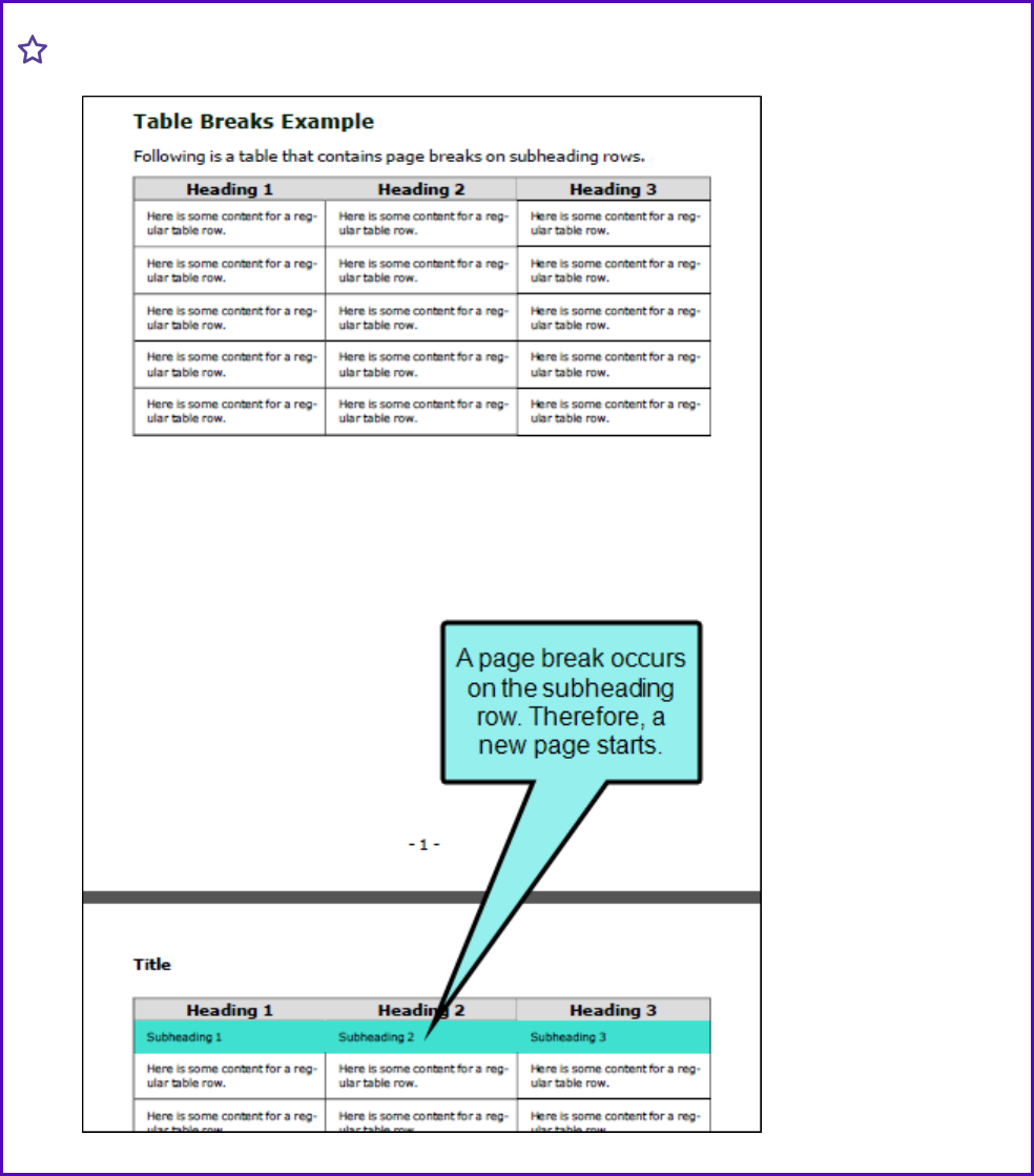
And in the PDF output, it would look like this:
CHAPTER 3
53

NOTE Because you can often control the look of a table in multiple ways—(1) local
formatting tools, (2) local table properties, (3) a table stylesheet, (4) a regular stylesheet, or
(5) branding stylesheet—it's possible that you might encounter conflicting settings from
time to time. When this happens, the settings closest to the content typically has
precedence. So precedence works like this: Local Formatting > Table Stylesheet > Regular
Stylesheet > Branding Stylesheet.
You open a regular stylesheet and specify that the outer borders of the table should be
green. Then you open the table stylesheet and specify that the outer borders should be red.
And then you open the Table Properties dialog and specify that the outer borders should be
blue. You've told Flare to do three different things to the same table. So in this case, the
table would display blue borders, because the local properties rule over the other settings.
But if you remove that setting from the Table Properties dialog and use the default setting,
the table would then display red borders, because the table stylesheet has precedence over
the regular stylesheet. And finally, if you remove the settings from both the Table
Properties dialog and table stylesheet, using the default setting in both, the table would
take its command from the regular stylesheet and display green borders.
NOTE If you are using a multi-column page layout and set an "Inside" break to "Avoid," you
must specify this in both the "Page Break" and "Column Break" fields.
NOTE Frame breaks are supported only in PDF output.
CHAPTER 3
54

Editing Table Cell Properties
After a table is inserted into a content file (e.g., topic, snippet), you can easily change the properties
for cells within that table. This includes changing the borders, text alignment, hyphenation,
background, and more.
How to Edit Table Cell Properties
1. Open the content file.
2. Select one or more cells within the table.
3. Do one of the following, depending on the part of the user interface you are using:
n
Ribbon Select Home > (at the bottom of the Paragraph section).
n
Keyboard Shortcut Press CTRL+ALT+B.
The Cell Properties dialog opens.
4. Using the tabs in the dialog you can change any of the following.
BORDERS
a. Select the Borders tab.
b. Set the options in the Borders section.
i. Click in any of the individual fields (Left, Right, Top, Bottom) to specify the
settings for the border. If you click the down arrow to the right of all the fields, the
settings will be applied to all of the border fields.
When you click that down arrow or in one of the individual fields, a small popup
displays.
ii. Use the lower-left area of the popup to enter a number for the border thickness.
iii. Use the lower-middle area to select a unit of measurement (e.g., point, pixel,
centimeter) for the number you entered.
iv. Use the upper-right area to select a color for the border.
v. Use the lower-right area to select a line type (e.g., solid, double, dashed) for the
border.
vi. Click OK.
CHAPTER 3
55
PADDING
a. Select the Borders tab.
b. Set the options in the Padding section. Click in any of the individual fields (Left, Right,
Top, Bottom) to specify the settings for the padding. In the left side of the field, enter a
number for the amount of padding. In the right side of the field, select a unit of
measurement (e.g., point, pixel, centimeter) for the number you entered.
If you click the down arrow to the right of all the fields, the settings will be applied to all
of the padding fields. When you click that down arrow, a small popup displays.
TEXT ALIGNMENT
a. Select the Text tab.
b. To set the horizontal alignment, in the Text Alignment section, select one of the
options.
n
Left Aligns the text on the left side of the cell.
n
Center Aligns the text on the center of the cell.
n
Right Aligns the text on the right side of the cell.
n
Justify Aligns the text so that it is flush with both the left and right side.
c. To set the vertical alignment, in the Alignment section, select one of the options.
n
Top The text aligns at the top of each cell.
n
Middle The text aligns in the middle of each cell.
n
Bottom The text aligns at the bottom of each cell.
TEXT INDENTATION
a. Select the Text tab.
b. Use the First line indent section. Specify the amount that you want to indent the first
line of a paragraph. Select Length in the top drop-down list and enter a number value.
You can then choose from several different units of measurement (points, pixels,
centimeters, etc.).
CHAPTER 3
56
TEXT LINE HEIGHT
a. Select the Text tab.
b. In the Line height section, click the down arrow in the upper-right corner and select
Length.
c. Enter a number in the field and use the down arrow in the lower-right corner to select a
unit of measurement.
This is the amount of space that will be added between lines.
HYPHENATION
a. Select the Hyphenation tab.
b. Use the tab to specify the hyphenation settings.
n
Enable Hyphenation Select whether you always or never want words to be
hyphenated at the end of lines.
n
Length of shortest word… Enter the minimum number of characters that a word
must have in order to be hyphenated.
n
The minimum number of characters remaining… Enter the minimum number of
characters that must remain on the initial line when a word is hyphenated. For
example, if you enter 4 in this field, a word that normally could be hyphenated
after two characters would not be broken at that point. Instead, it would not be
broken until at least four letters make an appearance on the first line.
n
The minimum number of characters carried over… Enter the minimum number of
characters that must be carried over to the second line when a word is
hyphenated. For example, if you enter 3 in this field, a hyphenated word must
have at least three characters on the second line after it has been broken.
n
The maximum number of adjacent lines… Enter the maximum number of lines
next to each other that are allowed to end with a hyphenated word. For example,
if you do not mind seeing three consecutive lines ending in a hyphenated word,
but you want to avoid seeing a fourth adjacent line with a hyphenated word, you
can enter 3 in this field.
CHAPTER 3
57

BACKGROUND
a. Select the Background tab.
b. Use the tab to specify the settings that you want for the background.
SET A COLOR FOR THE BACKGROUND
n
In the Color field, click the down arrow and select a color from the popup. For
advanced color options, select More Colors and use the fields in the Color Picker
dialog. In the Color Picker you can select a CSS variable.
ADD AN IMAGE TO THE BACKGROUND
i. Next to the Image field, click the Browse button. The Insert Image dialog opens.
ii. Select an image file to insert. You can do this in one of the following ways.
n
Select an image already in the project by finding and selecting it in the built-
in tree.
n
Click to find and select an image file outside of the project.
NOTE If you want to select an image file recently inserted into your
project, click the down arrow in the field next to the button, and select
the file from the list.
iii. Click OK.
iv. If you want the background image to repeat, select one of the options from the
Repeat field. You can also set the image position horizontally and vertically by
using the X and Y fields.
5. Click OK.
6.
Click to save your work.
CHAPTER 3
58

Merging Table Cells
You can turn multiple cells in a table into one big cell. This is called "merging" cells. You can merge
any number of rows and columns in a table, as long as they are adjacent to one another.
You might want to merge cells, for example, to create a wide cell that serves as a heading for a
group of columns under it.
How to Merge Cells in a Table
1. Open the content file.
2. Click inside a cell that will be on the outside edge of the new, bigger cell.
3. Hold down the mouse button and drag it to select surrounding cells. The cells that you select
are shaded.
4. Release the mouse button.
5. Do one of the following, depending on the part of the user interface you are using:
n
Ribbon Select Table > Merge Cells.
n
Right-Click Right-click the table and from the context menu, select Merge Cells.
6.
Click to save your work.
CHAPTER 3
59
Pasting Cells Within a Table
You can copy cells from one table to another. If you copy cells from a table, then place your cursor
within a single table cell and paste the contents, a paste icon displays to the right. This icon
lets you specify how you would like to handle the pasted cells. You can also set the default behavior
for similar actions in the future.
How to Paste Cells Within a Table
1. Open the content file.
2. Select the cells so that they are highlighted.
3. Press CTRL+C on your keyboard.
4. Open the content file (e.g., topic, snippet) containing the table that you want to paste into.
5. Do one of the following:
n
You can select the same number of cells if you simply want to transfer the cell text into
them.
n
Click in a single table cell.
6. Press CTRL+V on your keyboard.
7.
(Optional) You can click on the Paste icon and select any of the following options from
the menu.
n
Paste Cells Paste the copied cells, replacing the cells nearest to where you have placed
your cursor.
n
Paste Table Paste the copied cells as a separate table. It will be placed within the cell
where you have placed your cursor.
n
Paste (Above) Paste the copied cells above the cell where you have placed your cursor.
n
Paste (Below) Paste the copied cells below the cell where you have placed your cursor.
n
Paste (Left) Paste the copied cells to the left of the cell where you have placed your
cursor.
n
Paste (Right) Paste the copied cells to the right of the cell where you have placed your
cursor.
CHAPTER 3
60

n
Set Default Open the XML Editor tab in the Options dialog, choose the type of behavior
you want to use automatically when performing this action in the future, and click OK.
8.
Click to save your work.
CHAPTER 3
61
Resetting Local Cell Formatting
If you have applied local formatting to a table (e.g., applying background shading to cells directly,
not through the use of styles), you can easily remove it. This is possible even if the topic was
previously saved and closed.
How to Reset Local Cell Formatting
1. Open the content file.
2. Do one of the following, depending on the part of the user interface you are using:
n
Ribbon Select Table > Reset Local Cell Formatting.
n
Right-Click Right-click inside the table and from the context menu select Reset Local
Cell Formatting.
EXAMPLE You have a table with three columns and you have locally added a
different background color for each column. If you want to remove the background
colors for all of the columns, you simply need to place your cursor somewhere in the
table, right-click, and select Reset Local Cell Formatting.
However, let's say instead that you want to remove the background color for only the
middle column. In that case, you can select that column so that it is highlighted, right-
click, and then select Reset Local Cell Formatting.
3.
Click to save your work.
NOTE This option resets formatting placed on the entire cell (e.g., a background color
added to cells would be removed). However, local formatting on content (e.g., bold text) is
not affected. If you would like to remove local formatting for cells as well as cell content,
you can use the Remove Inline Formatting button instead.
CHAPTER 3
62

Selecting Styles for Table Cell Contents
When you insert a table, it is set up by default to use standard table tags in the individual cells (e.g.,
<th> for table headers, <td> for regular table text). However, if you press ENTER at the end of a line,
a <p> tag is added within the standard tag. Therefore, in order to keep all of the content in your table
cells looking consistent, there are a couple of things you can do. First, if you are editing table styles
in a regular stylesheet, you can create advanced selectors (e.g., "td p"). Second, you may want to
create a special style class of the p style to be used for table content (e.g., p.tabletext) and apply
that style to all of your cells when you first create a table. You can manually apply specific styles to
tables by selecting the table cells, clicking Table > Cell Content Style, and choosing the style to be
used for those cells.
Following are steps for using the Cell Content Style feature. For details on controlling table styles in
a regular stylesheet, including creating advanced selectors, see "Editing Table Styles in Regular
Stylesheets" on page 25.
NOTE For most projects, using an advanced selector in a regular stylesheet is probably the
best method to control the look of table cell content. Just use it with caution because it will
affect all paragraph tags in all tables. If you want to have a different default look for
paragraph content depending on the table, it might be better to use the cell content style.
How to Manually Select Styles for Table Cell Contents
1. Open the content file.
2. Select the table cells for which you want to use a certain style.
3. Select Table > Cell Content Style. The Table Cell Content Style dialog opens, displaying the
available paragraph styles in your stylesheet.
4. From the list, select the style that you want to use for the selected cells. If you select (none),
any paragraph style applied will be removed from those cells.
5. Click OK.
6.
Click to save your work.
CHAPTER 3
63

EXAMPLE If you keep the default table styles, you will see something like this:
CHAPTER 3
64

If you select all of the regular body rows in a table, open the Table Cell Content Style dialog,
and select a p style class, those cells will have that p style within a td style, like this:
However, rather than repeating all these steps each time you create a table, the easiest way to
accomplish this is to set a default cell content style. You can do this in a couple of ways: globally or
using a table stylesheet.
CHAPTER 3
65

Global Style Method
When you select Table > Cell Content Style, you can select the style you want and click the Set as
default check box.
Then when you insert a new table, the cells will already have the default style that you set, so you
don't need to select that style each time you create a table. This is a very quick and easy solution.
However, keep in mind that it is a global setting for all types of rows and all columns in every new
table that you insert in that project. For example, if you choose p.tabletext as the default in this
dialog, that style will automatically be initially set for all table header, body, and footer cells when
you create a table. So if you want different styles for the different parts of the table, you will need to
manually replace the default style in those table cells afterward.
If you use this method, none of the existing tables that you've already created and formatted in your
project are affected by the default setting. The default style is applied automatically only to new
tables and new table cells that are created in the project.
CHAPTER 3
66

Table Stylesheet Method
You can set defaults in your table stylesheets in the Cell Content Style section of the Table Style
Editor. In the Tag field, select the parent style (p). Then in the Class field, either select a style class
from the drop-down or type it directly in the field (e.g., TableRowText).
Default table cell styles can be set for any of the following: headers, rows, columns, and footers. In
addition, you can have different defaults for each table stylesheet in your project.
CHAPTER 3
67

Then when you insert a new table using a particular table stylesheet, the various parts of the table
(e.g., header, row, footer) will automatically start out with the appropriate styles so that you don't
have to set any of them manually.
This feature automatically applies the selected style class only in new tables (and in new cells
within existing tables) that are associated with the table stylesheet. It does not affect existing
tables.
If you also have a style set in the Table ribbon using the global method, your settings in a table
stylesheet override that style.
CHAPTER 3
68
Splitting Table Cells
You can turn one cell in a table into many smaller cells by splitting the cell. When you split a cell,
you are essentially inserting a smaller table into that cell.
How to Split Cells in a Table
1. Open the content file.
2. Click inside the table cell that you want to split into smaller cells, or select multiple cells if you
want.
3. Do one of the following, depending on the part of the user interface you are using:
n
Ribbon Select Table > Split Cells.
n
Right-Click Right-click the table and select Split Cells.
4. Complete the options in the Split Cells dialog as necessary.
NUMBER OF COLUMNS
Enter the number of columns to split the cell into.
NUMBER OF ROWS
Enter the number of rows to split the cell into.
NUMBER OF HEADER ROWS
Enter the number of header rows to include in the split cell. A header row can be used to hold
titles for the different columns. These rows are automatically repeated at the top of pages in
print-based output when a table covers more than one page.
NUMBER OF FOOTER ROWS
Enter the number of footer rows to include in the split cell. A footer row can be used to hold
footnote information.
CHAPTER 3
69

TABLE STYLE
Lists the table stylesheets (if any) that have been added. Select a stylesheet to associate it
with the split cell area, thus changing the appearance of the columns and rows. If you do not
select a table stylesheet, a simple table style is added without borders or other appearance
settings. If you want to associate a pre-designed style with the table to affect its look and
feel, you must first add the table style to the Split Cells dialog (using the Add button described
below). After the style is added to the dialog, simply select it from the Table Style area.
ADD
Opens the Select Table Style Template dialog, which you can use to add a new table
stylesheet. After clicking this button, complete the following steps.
a. In the Template Folders area, select a folder.
b. In the Templates area, select one of the templates from the folder. You can see a
preview of how the table will look in the Preview area below.
c. (Optional) You can type a new name for the style in the New Style Name field.
d. Click OK. The style is added to the Split Cells dialog. Now you can select it to associate
the style with the table.
MERGE CELLS BEFORE SPLIT
Select this option if you have selected multiple cells in the table and want to merge them into
one cell before splitting it.
5. Click OK.
The cell is split into new cells according to your selections in the Split Cell dialog. Now you
can click in any cells of the table and add content (e.g., text, images, hyperlinks) as necessary.
6.
Click to save your work.
CHAPTER 3
70

Cutting Table Columns and Rows
You can cut entire columns and rows in a table. When you do this, a paste icon displays after
the table. This icon lets you specify how you would like to handle the content when you cut the
columns or rows. You can also set the default behavior for similar actions in the future.
How to Cut Table Columns and Rows
1. Open the content file.
2. Select the column or row that you want to cut so that the cells are highlighted.
3. Press CTRL+X on your keyboard.
4.
(Optional) You can click on the Paste icon and select any of the following options from
the menu, depending on whether you cut columns and/or rows.
n
Cut ColumnsSelect this option to entirely cut the selected columns, removing both the
columns and content from the table.
n
Cut RowsSelect this option to entirely cut the selected rows, removing both the rows
and content from the table.
n
Cut Cell Contents Select this option to cut only the content from the selected columns
or rows, leaving the empty columns in the table.
n
Set Default Open the XML Editor tab in the Options dialog, choose the type of behavior
you want to use automatically when performing this action in the future, and click OK.
5.
Click to save your work.
CHAPTER 3
71

Inserting Table Columns and Rows
You can easily insert additional rows and columns into an existing table. You can insert one row or
column at a time, or you can insert multiple rows or columns.
How to Insert a Column
1. Open the content file.
2. Do one of the following:
n
Place your cursor in the table where you want to insert the column. Doing this will insert
only one column.
n
In a table, click and drag to select the number of columns you want to add (e.g., if you
want to insert three columns, select three in the table). You do not need to select entire
columns, just portions of them.
3. Do one of the following, depending on the part of the user interface you are using:
n
Ribbon Select Table > Columns to the Left or Table > Columns to the Right, depending
on where you want to insert the column(s).
n
Right-Click Right-click the table and select Insert > Columns to the Left or Insert >
Columns to the Right, depending on where you want to insert the column(s).
4.
Click to save your work.
CHAPTER 3
72

How to Insert a Row
1. Open the content file.
2. Do one of the following:
n
Place your cursor inside the table where you want to insert the row. Doing this will
insert only one row when you are finished.
n
In a table, click and drag to select the number of rows you want to add (e.g., if you want
to insert three rows, select three in the table). You do not need to select entire rows,
just portions of them.
3. Do one of the following, depending on the part of the user interface you are using:
n
Ribbon Select Table > Rows Above or Table > Rows Below, depending on where you
want to insert the row(s).
n
Right-Click Right-click the table and select Insert > Rows Above or Insert > Rows Below,
depending on where you want to insert the row(s).
4.
Click to save your work.
CHAPTER 3
73

Moving Table Columns and Rows
You can move columns and rows around in a table that you have inserted by dragging and dropping
the structure bars. You can also move table rows by using keyboard shortcuts.
How to Move Columns and Rows by Dragging and
Dropping
1. Open the content file.
2.
If the tag block bars are not shown to the left of the content, click at the bottom of the
editor.
3. Click the appropriate tag bar to the left of the topic or column bar (in the span area) above the
topic, and drag the row or column to the place where you want to move it. A blue arrow helps
guide you, showing you where the row or column will be inserted when you release the mouse
button.
4. Release the mouse button to drop the row or column to its new location in the table. The row
or column is moved to its new location.
5.
Click to save your work.
How to Move Rows With Keyboard Shortcuts
1. Open the content file.
2. In a table, click and drag to select the number of rows you want to move (e.g., if you want to
move three rows, select three in the table). You do not need to select entire rows, just
portions of them.
3. Hold down ALT+SHIFT on your keyboard and press the Up or Down arrow key.
4.
Click to save your work.
CHAPTER 3
74

What’s Noteworthy?
NOTE You can move table columns and rows only within the same table. If you want to
move a column or row from one table to another, you need to use the copy and paste
options, and then delete the column or row from the original table. To copy a column or
row, right-click on the bar and select Copy. To paste the column or row in the other table,
right-click on a bar next to the column or row where you want to paste it and select Paste
(Above), (Below), (Left), or (Right). There is no cut option.
CHAPTER 3
75

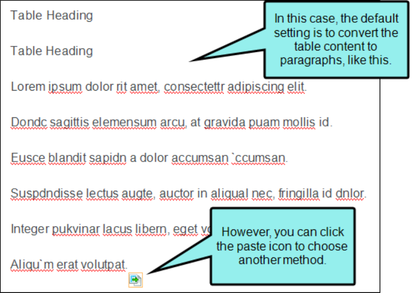
Converting Tables to Text
If you have a table containing text, you can remove the table but keep the text. When doing this, you
can choose how the converted text should be represented: paragraphs, separated with commas,
separated with text.
How to Convert a Table to Text
1. Open the content file.
2. Place your cursor somewhere in the table.
3. Select Table > Convert to Text. The table is converted to text using the default method—
convert to paragraphs, with commas, or with text string.
4.
(Optional) If you want the conversion to use a different method, click the icon that appears
after the text and select the method.
n
Convert to Paragraphs Convert the content in each table cell into separate paragraphs.
n
Separate with Commas Convert the content in each table cell into text separated by
commas.
n
Separate with Text Convert the content in each table cell into text separated by a text
string that you specify (e.g., a semicolon).
n
Set Default Open the XML Editor tab in the Options dialog, choose the type of behavior
you want to use automatically when performing this action in the future, and click OK.
CHAPTER 3
76
CHAPTER 3
77

CHAPTER 3
78

5.
Click to save your work.
CHAPTER 3
79
Converting Text to Tables
If you have a series of paragraphs or some text separated by commas or other strings, you can
quickly place all of it into a table.
How to Convert Text to a Table
1. Select the text to be converted, so that it is highlighted.
2. Select Table > Insert Table (face of the button).
3. In the Text to Table section, select one of the options.
n
None Creates a table but does not include any of the selected text (i.e., text is removed
and replaced with new table).
n
Paragraphs Converts multiple paragraphs to a table (each paragraph placed in a
separate table cell).
n
Commas Converts text separated by commas to a table (each segment of text between
a comma placed in a separate table cell).
n
Tabs Converts text separated by tabs to a table (each segment of text between a tab
separator placed in a separate table cell).
n
Other Converts text separated by a specific text string (e.g., semicolons) to a table.
After selecting this option, enter that text string in the field to the right. Each segment
of text between the text string that you specify will be placed in a separate table cell.
CHAPTER 3
80


4. Click OK. The text is converted to a table.
5.
Click to save your work.
CHAPTER 3
82

Merging Tables
If you have two tables in a content file (e.g., topic, snippet) that are positioned one after the other,
you can merge those tables so that they become one. You can do this by using the icon that may
appear to the right of the tables.
How to Merge Tables
1. Open the content file.
2. Perform an action to display the floating icon. Usually this means removing content between
two tables so that they become adjacent, or copying and pasting one table before or after
another.
3.
Click the icon to the right of the tables.
4. Select the option that best suits your needs, depending on the type of action that you
performed.
n
Merge Table Up Select this option to merge the tables, with the table on top having
precedence. Therefore, the merged table will use the table stylesheet from that table.
n
Merge Table Down Select to merge the tables, with the table on the bottom having
precedence. The merged table will use the table stylesheet from that table.
n
Don't Merge Tables Select this option to allow the tables to appear one after the other,
without being merged into one table.
n
Paste Table Select to paste the table as a whole. Therefore, you will actually have two
separate tables next to each other.
n
Paste (Above) Select to merge the rows and columns from the copied table into the
existing one, above the rows from the other table. The table that was there first will
have precedence. Therefore, the merged table will use the table stylesheet from that
table.
n
Paste (Below) Select to merge the rows and columns from the copied table into the
existing one, below the rows from the other table. The table that was there first will
have precedence. Therefore, the merged table will use the table stylesheet from that
table.
n
Set Default Open the XML Editor tab in the Options dialog, choose the type of behavior
you want to use automatically when performing this action in the future, and click OK.
CHAPTER 3
83

5.
Click to save your work.
NOTE You cannot merge tables if the column count is different in them.
CHAPTER 3
84

Repeating Table Captions and Header Rows
For print-based output, table captions and header rows can be repeated so at the top of pages
when a table covers more than one page. Repeating table captions is supported in PDF output only.
Repeating table header rows is supported in PDF and Word outputs.
CHAPTER 3
85

How to Repeat Captions in a Single Table
1. Insert a new table, or right-click inside an existing table and select Table Properties.
2. On the General tab, in the Table Caption section, enter a caption in the Text field.
3. Select Repeat.
4. (Optional) In the Continuation field, you can add text to the end of captions that repeat on
subsequent pages (e.g., Continued)."
5. Click OK.
6.
Click to save your work.
CHAPTER 3
86

How to Repeat Captions in All Tables
1. From the Content Explorer, open the stylesheet that you want to modify.
2.
In the local toolbar, make sure the first button displays . If the button displays
instead, then click it.
3. In the upper-left corner of the editor, click in the drop-down field and select
.
4. On the left side of the editor, select table.
5. From the Show drop-down list on the upper-right side of the editor, select
. The most relevant properties for that style are shown on the
right side of the editor.
6.
If you are using the group view , expand the Table group.
7. Locate the property you want to change.
n
mc-caption-repeat If you want captions to repeat on tables that span multiple pages in
print-based output, click and select true.
n
mc-caption-continuation You can add text to the end of captions that repeat on
subsequent pages (e.g., continued)."
8.
Click to save your work. Captions are repeated for any tables where you have added them
in the table properties.
CHAPTER 3
87
How to Repeat Table Header Rows
1. Insert a new table, or right-click inside an existing table and select Table Properties.
2. On the General tab, in the Table Size section, enter a number in the Number of header rows
field. Usually this is 1. These rows will automatically be repeated at the top of pages in print-
based output.
CHAPTER 3
88

Resizing Tables
You can change the height and width of tables by applying an absolute or relative unit of
measurement. You can also change the size of tables and individual rows and columns by clicking
and dragging the edges of the table bars.
How to Resize Tables via Unit of Measurement
1.
If the tag block bars are not shown to the left of the content, click at the bottom of the
editor.
2. Right-click the table tag bar to the left of the table.
3. In the context menu select Table Size.
4. Enter a value in the Reset Width and/or Reset Height field.
5. Click in the drop-down field and select a unit of measurement (e.g., Point, Centimeter, Ems,
Percentage).
6.
Click .
7.
Click to save your work.
CHAPTER 3
89

How to Resize Tables, Rows, and Columns via Dragging
1. Make sure that the tag bars and span bars are shown to the left of the table and above the
table, respectively. If they are not shown, click (to show the tag bars), and click (to
show the span bars) at the bottom of the editor.
2. Do any of the following:
n
To Resize the Width of the Entire Table Click inside the table. Then click the far right
edge of the bar for the entire table (the top bar) and drag it right or left.
CHAPTER 3
90

n
To Resize an Individual Table Row Click the upper or lower edge of the row bar and
drag it up or down.
CHAPTER 3
91

n
To Resize an Individual Table Column Click inside the table. Then click the left or right
edge of the column bar and drag it right or left.
3.
Click to save your work.
What’s Noteworthy?
NOTE You can also use "auto-fit" behaviors in the Properties dialog to automatically resize
a table. See "Editing Table Properties" on page 115.
NOTE If you set a table to a specific height, that height may not be represented accurately
if you are viewing the topic in Print Layout mode.
CHAPTER 3
92

Creating Rounded Borders on Paragraphs and
Tables
Supported In:
For most output formats, you can use CSS3 border-radius style properties to create rounded
borders on block elements, such as paragraphs and blockquotes. You can also use set rounded
borders on tables.
CHAPTER 3
93
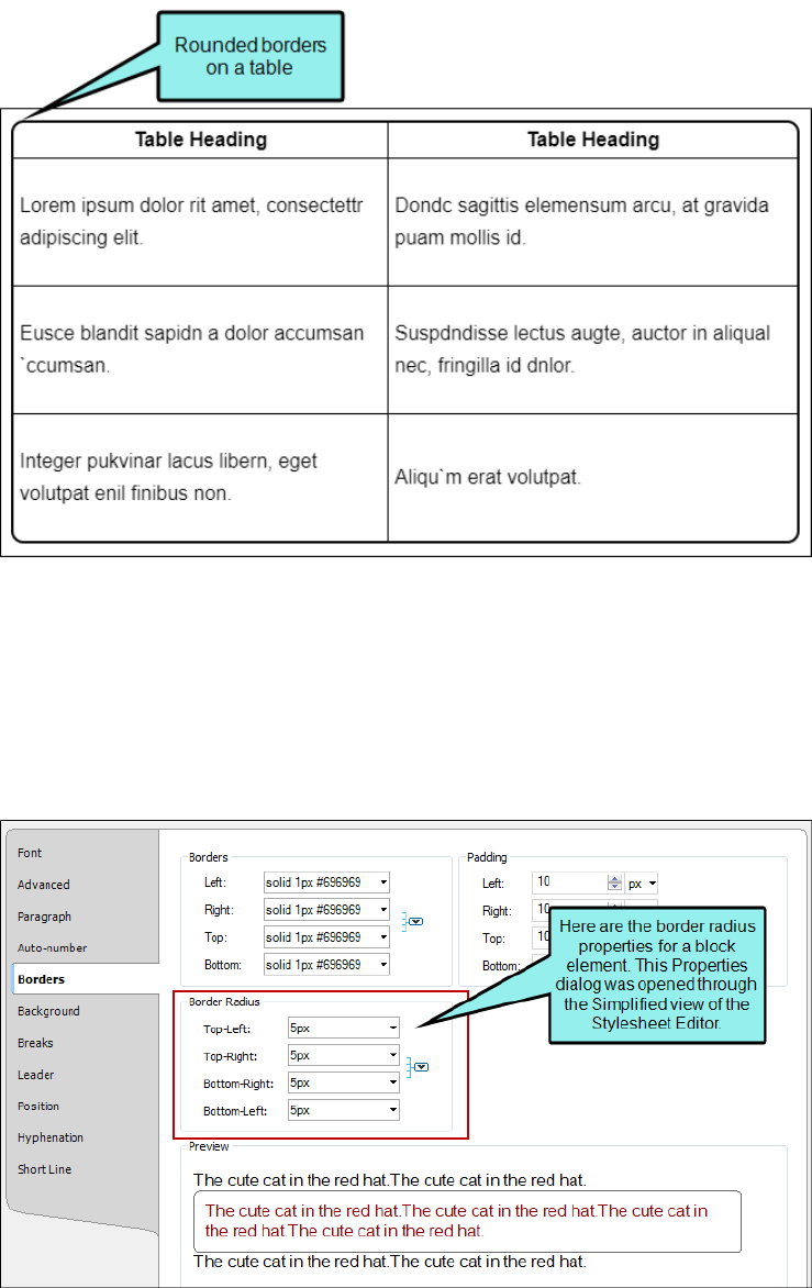
Rounded Borders and Block Elements
The properties for block elements are available in the Stylesheet Editor and in other areas of the
user interface, such as the Paragraph Properties dialog.
CHAPTER 3
94

Rounded Borders and Tables
For tables, you can set rounded borders in either a regular stylesheet or in a special table
stylesheet. You can also set them locally in the Table Properties dialog.
CHAPTER 3
95

Regular Stylesheet
By setting rounded borders on the table style in a regular stylesheet, all of your tables will have the
rounded borders.
CHAPTER 3
96

Table Stylesheet
If you set rounded borders in a special table stylesheet, using the Table Style Editor, only the tables
using that stylesheet will have rounded borders.
CHAPTER 3
97

Additional Required Settings for Rounded Borders on Tables
When setting rounded borders on tables, it is essential that you also set two other style properties.
First, you must set the border-collapse property to "separate" (in a regular stylesheet) or "Do not
collapse cell borders" (in a table stylesheet or the Table Properties dialog).
CHAPTER 3
98

Second, you must set the overflow property to "hidden." This property prevents a background color
in the table from obstructing the rounded corners, thus making the table look as if it still has square
corners.
CHAPTER 3
99

CHAPTER 3
100

If you do not want to lose your background color, you might consider creating your tables without
an outer border. That way, the rounded borders will still be shown in most browsers and in PDF
output.
EXAMPLE You have a table with a colored background, but without outer borders. With
rounded corners it looks like this in most newer browsers:
CHAPTER 3
101

How to Use a Style to Set Rounded Borders on Block
Elements
1. From the Content Explorer, open the stylesheet that you want to modify.
2.
In the local toolbar, make sure the first button displays . If the button displays
instead, then click it.
NOTE For steps using the Simplified view, see the online Help.
3. In the upper-left corner of the Stylesheet Editor, click in the drop-down field and select
.
4. Select the appropriate paragraph style. For example, you can select the parent p tag, or you
can select a class that you may have created for that tag (e.g., p.Tip, p.Note).
5.
From the Show drop-down list on the upper-right side of the editor, select .
6. (Optional) You can use the toggle button in the local toolbar to show properties below in a
group view or an alphabetical view .
7. If you are using the grouped view, expand the Border group.
8. Locate and select the border-radius property that you want to change. Each corner (bottom-
left, bottom-right, top-left, top-right) can be set separately (e.g., border-bottom-left-radius,
border-top-right-radius). Even better, you can set the main border-radius property, which lets
you specify the amount of curve for all four corners in one place.
9. The area to the right of the property is used for selecting and entering values.If you know
how to enter the information correctly, you can click in the value field and type it
directly.Otherwise, click the ellipsis button to the right of the property.Depending on the
type of property, the appropriate controls and options display, allowing you to choose or enter
values (e.g., select from a drop-down list, click a button, complete fields in a dialog or
popup).If you completed values in a popup, click OK at the bottom of the box.
In the popup, you can enter the amount of curve you want in the H field (for Horizontal) and
the V field (for Vertical). If you are setting values for the main border-radius property, you will
see a small icon in the upper-left corner of the popup. If you click this icon, the popup
changes, showing individual H and V fields for the four corners (Top Left, Top Right, Bottom
Left, Bottom Right). For more information on using multiple sets of border radius properties,
see www.css3.info/preview/rounded-border/.
10. If you are using the grouped view, expand the Table group.
CHAPTER 3
102

11. For the border-collapse property, select separate.
12. If you are using the grouped view, expand the Positioning group.
13. For the overflow property, select hidden.
14.
Click to save your work.
CHAPTER 3
103

How to Use a Table Stylesheet to Set Rounded Borders
on Tables
1. Open the table stylesheet that you want to edit. This can be found in the Resources >
TableStyles subfolder in the Content Explorer, but you can store table stylesheets in other
folders in the Content Explorer if you like.
2. In the Table Style Editor, select the General tab.
3. In the Cell Border Collapse area, select Do not collapse cell borders.
4. Set the options in the Border Radius section.
a. Click in any of the individual fields (Top-Left, Top-Right, Bottom-Right, Bottom-Left) to
specify the settings for a particular corner of the table. If you click the down arrow to
the right of all the fields, the settings will be applied to all of the fields.
When you click that down arrow or in one of the individual fields, a small popup
displays.
This popup has two halves. You can complete only the left side of the popup if you like.
This will create a curve that is equal horizontally and vertically. If you want a border to
have more of a curve either horizontally or vertically, you can complete the fields in the
right half of the popup as well, so that you have two values (e.g., 10px 15px) instead of
one. For more information on using two sets of border radius properties, see
css3.info/preview/rounded-border/.
b. Use the lower-left area of the popup to enter a number for the amount of curve. The
greater the number, the more curve that is applied.
c. Use the area to the right of the number field to select a unit of measurement (e.g., point,
pixel, centimeter).
d. If you want to provide a second value for the rounded border, complete the same fields
on the right half of the popup.
e. Click OK.
5. Scroll down to the bottom of the tab, and in the Advanced area, click in the Overflow drop-
down and select Hidden.
6.
Click to save your work.
CHAPTER 3
104

How to Use a Regular Stylesheet to Set Rounded
Borders on Tables
1. From the Content Explorer, open the stylesheet that you want to modify.
2.
In the local toolbar, make sure the first button displays . If the button displays
instead, then click it.
NOTE For steps using the Simplified view, see the online Help.
3. In the upper-left corner of the editor, click in the drop-down field and select
.
4. In the grid below, select table.
5.
From the Show drop-down list on the upper-right side of the editor, select .
6. (Optional) You can use the toggle button in the local toolbar to show properties below in a
group view or an alphabetical view .
7. If you are using the grouped view, expand the Border group.
8. Locate and select the border-radius property that you want to change. Each corner (bottom-
left, bottom-right, top-left, top-right) can be set separately (e.g., border-bottom-left-radius,
border-top-right-radius). Even better, you can set the main border-radius property, which lets
you specify the amount of curve for all four corners in one place.
9. The area to the right of the property is used for selecting and entering values.If you know
how to enter the information correctly, you can click in the value field and type it
directly.Otherwise, click the ellipsis button to the right of the property.Depending on the
type of property, the appropriate controls and options display, allowing you to choose or enter
values (e.g., select from a drop-down list, click a button, complete fields in a dialog or
popup).If you completed values in a popup, click OK at the bottom of the box.
In the popup, you can enter the amount of curve you want in the H field (for Horizontal) and
the V field (for Vertical). If you are setting values for the main border-radius property, you will
see a small icon in the upper-left corner of the popup. If you click this icon, the popup
changes, showing individual H and V fields for the four corners (Top Left, Top Right, Bottom
Left, Bottom Right). For more information on using multiple sets of border radius properties,
see www.css3.info/preview/rounded-border/.
10.
Click to save your work.
CHAPTER 3
105

What’s Noteworthy?
NOTE Some older browsers may not support rounded borders, so even if you create the
rounded borders for your content, they may display as rounded in some browsers but
square in others.
NOTE Different browsers display different results if you have all of the following set on a
table: a caption, rounded borders, and a color in the background of the first row. That's
because some browsers consider the caption part of the table and others do not. One
possible workaround is to set the border-top-left-radius and border-top-right-radius on the
top-left and top-right cells.
CHAPTER 3
106
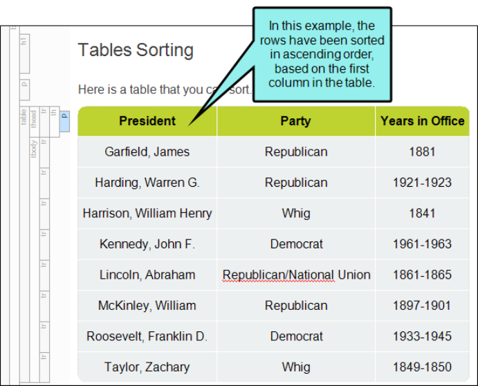
Sorting Tables
You can sort a table by selecting an option from the Table ribbon at the top of the interface or from
table context menus. Tables can be sorted using a simple or more advanced method.
How to Sort Tables—Simple
1. Open the content file.
2. Do one of the following:
n
If you want to sort all rows in the table, place your cursor inside the table. The rows will
be reordered based on the column where your cursor is placed.
CHAPTER 3
107
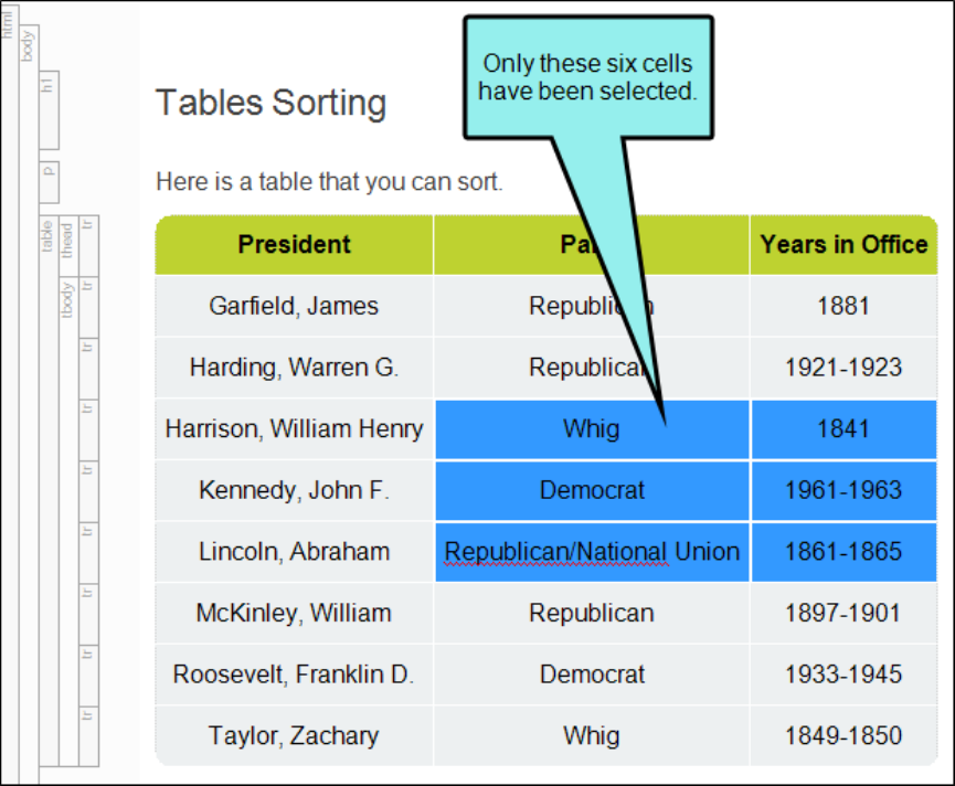
n
If you want to sort only certain rows in the table, select those rows so that they are
highlighted. The rows will be reordered based on the content of the first column in your
selection.
CHAPTER 3
108

3. Do one of the following, depending on the part of the user interface you are using:
n
Ribbon Select Table > Ascending > Ascending or Table > Ascending > Descending.
n
Right-ClickDo one of the following:
l
Right-click inside the table and from the context menu, select Sort Rows >
Ascending or Sort Rows > Descending.
l
Right-click one of the appropriate tag bars to the left of the table, depending on the
rows you want to sort (e.g., table, thead, tfoot), and from the context menu, select
Sort Rows > Ascending or Sort Rows > Descending.
4.
Click to save your work.
CHAPTER 3
109

How to Sort Tables—Advanced
1. Open the content file.
2. Place your cursor inside the table.
3. Do one of the following, depending on the part of the user interface you are using:
n
Ribbon Select Table > Ascending > Advanced Sorting Options.
n
Right-ClickDo one of the following:
l
Right-click inside the table and from the context menu, select Sort Rows > Advanced
Sorting Options.
OR
l
Right-click one of the appropriate tag bars to the left of the table, depending on the
rows you want to sort (e.g., table, thead, tfoot), and from the context menu, select
Sort Rows > Advanced Sorting Options.
The Advanced Sorting Options dialog opens.
4.
Click . A row is added to the grid on the right.
5. In the Column cell, click the down arrow and choose the column to sort by. Then in the
Direction cell choose ascending or descending.
6.
(Optional) If you want to add another row, telling Flare which column to sort by next, click
again. In the Column cell, click the down arrow and choose the column to sort by next. Then
in the Direction cell choose ascending or descending. Repeat this for each additional row you
want to add to the grid.
7. (Optional) Use the buttons on the right side of the dialog if you want to remove or rearrange
the order of any of the rows in the grid.
8. (Optional) If you want Flare to automatically update the table sorting when you generate
output, select Apply at compile time. This can be useful in case you make changes to the
table in the XML Editor and want Flare to automatically make the changes so you don't have
to.
9. (Optional) If you want Flare to apply the sorting rules to the table right away in the XML Editor,
click Apply now.
10. Click OK.
11.
Click to save your work.
CHAPTER 3
110

EXAMPLE You have a table listing winners of the New York Marathon for a 10-year period,
like this:
CHAPTER 3
111

Suppose you want to re-organize the information in this table. Maybe you want to sort first
of all by the country of each runner (the third column) in ascending order.
With the third column organized, you then want the rows to be organized once more
according to the best times (the fourth column) in ascending order.
So you right-click the table structure bar and choose Sort Rows, then Advanced Sorting
Options.
CHAPTER 3
112

In the Advanced Sorting Options dialog, your settings would look like this:
CHAPTER 3
113

As a result, the table would be reorganized to look like this:
CHAPTER 3
114
Editing Table Properties
After a table is inserted into a content file (e.g., topic, snippet), you can easily change the properties
of that table. This includes changing the number of columns and cells, the style associated with the
table, alignment, borders, and more.
How to Edit Table Properties
1. Open the content file.
2. Click inside the table.
3. Do one of the following, depending on the part of the user interface you are using:
n
Ribbon Select Table > Table Properties.
n
Right-Click Right-click the table and from the context menu, select Table Properties.
4. Select the General tab and modify the options as necessary.
TABLE SIZE
n
Number of columns Enter the number of columns for the table.
n
Number of rows Enter the number of rows for the table.
n
Number of header rows Enter the number of header rows for the table. A header row
can be used to hold titles for the different columns in the table. These rows are
automatically repeated at the top of pages in print-based output when a table covers
more than one page.
n
Number of footer rows Enter the number of footer rows for the table. A footer row can
be used to hold footnote information about the table.
CHAPTER 3
115

TABLE CAPTION
n
Text Enter a caption (or title) for the table. This caption can be placed above the table
or below it.
n
Side Click in this field and select to place the caption either above or below the table.
n
RepeatIf you want captions to repeat on tables that span multiple pages in print-based
output, select Repeat from this field.
n
Continuation In this field, you can enter continuation text to the end of captions that
repeat (other than the caption appearing on the first page where a table occurs).
Typically this text would be something like "(continued)."
CHAPTER 3
116

SUMMARY
You can enter a summary for a table. This adds the "summary" attribute to the <table> tag
and is used to help make your output more accessible to individuals with disabilities.
AUTOFIT BEHAVIOR
n
AutoFit to contents Automatically sets the column widths to the same width as the
table content.
n
AutoFit to window Automatically sets the table width to the same width as the output
window.
n
Fixed column width Sets the column widths to the width that you specify. Select the
down arrow next to this field and set the width in the popup.
ALIGN
Aligns the entire table either to the left, right, or center of the topic.
TABLE STYLE
You can select to use either a special table stylesheet or the table style from a regular
stylesheet. Whichever one you choose will control the look of the table that you insert. When
you add a table stylesheet to your project, it is stored in the Content Explorer, Resources >
TableStyles subfolder.
CHAPTER 3
117

n
Table Style Select this option if you want to use a table stylesheet to control the look of
the table. You can then select an existing table stylesheet from the drop-down list.
CHAPTER 3
118
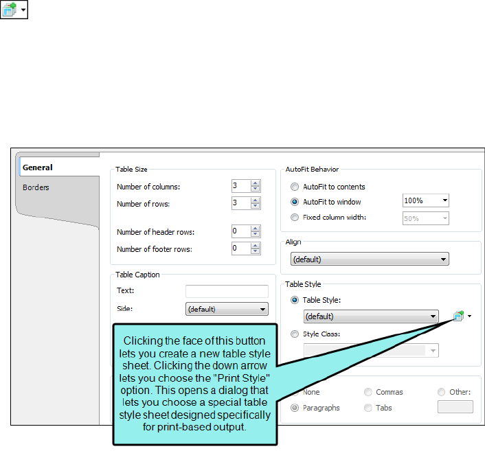
n
If you do not yet have a table stylesheet that you want to use, click the face of this
button to open the Select Table Style Template dialog. This lets you create new table
stylesheet. If you click the down arrow next to the button, you can select Print Style.
This opens the Select Table Style dialog, which you can use to specify another table
style to be used specifically for printed output. However, it is recommended that you
use a medium instead of the "Print Style" option.
CHAPTER 3
119

n
Style Class Select this option if you want to use a regular stylesheet to control the look
of the table. You can then select the main table style from the drop-down, or you can
select any class that you have added under that style. You can create classes for the
table style in the Stylesheet Editor; those classes will then become available in this
drop-down field.
CHAPTER 3
120
TEXT TO TABLE
These options are enabled if you have selected text before opening the dialog to insert the
table. This lets you create the table and quickly place all of the selected text into table cells.
n
None Creates a table but does not include any of the selected text (i.e., text is removed
and replaced with new table).
n
Paragraphs Converts multiple paragraphs to a table (each paragraph placed in a
separate table cell).
n
Commas Converts text separated by commas to a table (each segment of text between
a comma placed in a separate table cell).
n
Tabs Converts text separated by tabs to a table (each segment of text between a tab
separator placed in a separate table cell).
n
Other Converts text separated by a specific text string (e.g., semicolons) to a table.
After selecting this option, enter that text string in the field to the right. Each segment
of text between the text string that you specify will be placed in a separate table cell.
5. Select the Borders tab and modify the options as necessary.
n
Outer Borders Click in any of the individual fields (Left, Right, Top, Bottom) to specify
the settings for the table border. If you click the down arrow to the right of all the fields,
the settings will be applied to all of the border fields. When you click the down arrow or
in one of the individual fields, a small popup displays. Use the lower-left area of the
popup to enter a number for the thickness of the border. Use the lower-middle area to
select a unit of measurement (e.g., point, pixel, centimeter) for the number you entered.
Use the upper-right area to select a color for the border. And use the lower-right area to
select a line type (e.g., solid, double, dashed) for the border. When you are finished, click
OK in the small popup.
CHAPTER 3
121

n
Border Radius These fields let you create rounded corners on the table. Click in any of
the individual fields (Top-Left, Top-Right, Bottom-Right, Bottom-Left) to specify the
settings for a particular corner of the table. If you click the down arrow to the right of all
the fields, the settings will be applied to all of the fields.When you click that down
arrow or in one of the individual fields, a small popup displays. This popup has two
halves. You can complete only the left side of the popup if you like. This will create a
curve that is equal horizontally and vertically. If you want a border to have more of a
curve either horizontally or vertically, you can complete the fields in the right half of the
popup as well, so that you have two values (e.g., 10px 15px) instead of one. For more
information on using two sets of border radius properties, see
css3.info/preview/rounded-border/. Use the lower-left area of the popup to enter a
number for the amount of curve. The greater the number, the more curve that is
applied.Use the area to the right of the number field to select a unit of measurement
(e.g., point, pixel, centimeter). If you want to provide a second value for the rounded
border, complete the same fields on the right half of the popup. When you are finished,
click OK in the small popup.
n
Cell Border Collapse Select whether you want to collapse the cell borders in the table. If
you collapse the cell borders, the row and cell borders of a table are joined in a single
border. If you do not collapse the cell borders, the row and cell borders of a table are
detached. If you use the border radius properties to create rounded borders, this must
be set to "Do not collapse cell borders."
n
Cell Border Spacing Use to increase or decrease the cell border spacing (in pixels).
n
Hide bottom ruling when table crosses a page break Set this field to True if you want to
hide the bottom border when the table continues on another page. See "Hiding the
Bottom Border on Tables When Crossing Page Breaks" on page 30.
n
Overflow This determines what happens if content overflows the table.
l
Visible The overflow is not clipped. It renders outside the table. This is default.
l
Hidden The overflow is clipped, and the rest of the content is invisible. If using
border-radius properties, select this option for the rounded corners to be seen.
l
Scroll The overflow is clipped, but a scroll-bar is added to see the rest of the content.
l
Auto If overflow is clipped, a scroll-bar is added to see the rest of the content.
l
Inherit The value of the overflow property is inherited from the parent element.
6. Click OK.
7.
Click to save your work.
CHAPTER 3
122

Table Stylesheets
A table stylesheet lets you create a look that can be applied to several tables throughout your
project. To change the look of general topic content, you can use a regular stylesheet. If you need to
change branding for your project, you can use a branding stylesheet. In fact, using these
stylesheets are other ways to control the look of tables.
You can create as many table stylesheets as you need. The recommended location to store a table
stylesheet in the Content Explorer is in the Resources > TableStyles folder. However, you can store
it anywhere in the Content Explorer that you like.
Process
1. "Creating Table Stylesheets" on page 126
2. "Editing Table Stylesheets" on page 130
3. "Applying Table Stylesheets to Tables" on page 145
Other Information
n
"Table Style Editor" on page 149
n
"Table Styles and RTL Languages" on page 150
CHAPTER 3
123

EXAMPLE You might use two different types of tables in your project—a basic one (with
simple borders and no shading) and a patterned one (with customized borders and colored
shading in certain rows and columns). So you create one table stylesheet (let's say it's
called "Basic.css") and format it the way you want, and then you create a second table
stylesheet (let's say it's called "Alternate-Row-Color.css") and format it. Then, as you insert
tables into your topics, you can associate the new table with one of these two table
stylesheets.
CHAPTER 3
124


NOTE If you are importing Adobe FrameMaker documents and have tables that you have
formatted in a certain way, you can create matching table styles as a result of the import.
This can be specified on the Options page of the Import FrameMaker Wizard. In the Flare
project, the new table styles will be named after the format named applied to the table in
FrameMaker (e.g., "Format_A.css," "Format_B.css," and so on). You can rename these table
stylesheets in Flare after the import. Even if you do not use this mapping feature, the table
formatting still comes across when you import the files. The only difference is that table
stylesheets make it easier to maintain the formatting of your tables within Flare.
Process for Table Stylesheets
Certain tasks must be completed in order when using this feature.
1. "Creating Table Stylesheets" below
2. "Editing Table Stylesheets" on page 130
3. "Applying Table Stylesheets to Tables" on page 145
Creating Table Stylesheets
You can add a stylesheet to be used specifically for tables. The traditional location to store a table
stylesheet in the Content Explorer is in the Resources > TableStyles folder. However, you can store
it anywhere in the Content Explorer that you like.
CHAPTER 3
126

How to Create a Table Stylesheet
1. Do one of the following, depending on the part of the user interface you are using:
n
(Recommended) Right-Click In the Content Explorer, right-click on a folder and from the
context menu select New > Table Style.
TIP When adding a new file to the Content Explorer, the recommended method
is to right-click on the folder in the Content Explorer and use the New menu
option. This is the most efficient way to direct the new file to the folder where
you want to store it. That's because the Add File dialog opens when you add a
new content file, and this method ensures that the folder you want is already
selected in that dialog.
n
Ribbon Select Project > New > Table Style.
The Add File dialog opens.
2. In the File Type field at the top, make sure Table Style is selected.
3. In the Source area, choose to create the new file based on a template or an existing file.
n
New From Template Choose either a factory template file or one of your own custom
template files as a starting point. The new file will take on all of the settings contained
in the template. If you want to use the factory template provided by Flare, expand the
Factory Templates folder and click on a template file. If you want to use your own
custom template file, expand the appropriate folder and click on a file. For more
information about templates, see the online Help.
n
New From Existing Choose an existing file of the same type as a starting point for your
new file. As with template files, your new file will take on all of the settings contained in
the file you select. To use this option, click , use the Open File dialog to find a file, and
double-click it.
4. (Optional) The Folder field is automatically populated with the folder that has focus in the
Content Explorer. If you want to place the file into a folder that you previously created in the
Content Explorer, in the Folder field click and select the subfolder. Otherwise, keep the
default location.
NOTE If you want to place non-topic files in a recommended folder, first make sure
that folder exists in the Content Explorer. If it does not exist, you can easily add it.
CHAPTER 3
127

Non-Topic File Type Recommended Default Folder in Content Explorer
Branding Resources > Branding
Image Resources > Images
Micro Content Resources > MicroContent
Multimedia Resources > Multimedia
Page Layout Resources > PageLayouts
Snippet Resources > Snippets
Stylesheet Resources > Stylesheets
Table Stylesheet Resources > TableStyles
Template Page Resources > TemplatePages
5. In the File Name field, type a new name for the stylesheet.
6. (Optional) If you want to apply condition tags to the file, expand the Attributes section at the
bottom of the dialog. Next to the Condition Tags field, click and select the conditions you
want to apply.Click OK.
7. (Optional) If you want to apply file tags, expand the Attributes section at the bottom of the
dialog. Next to the File Tags field, click and select the file tags you want to apply.Click OK.
8. Click Add. The table stylesheet is added and opens in its own page in the Table Style Editor.
CHAPTER 3
128

NOTE You can create a new table stylesheet while inserting a table into a topic. In the
Insert Table dialog, click face of the Create New Table Style button (not the down
arrow) and complete the options in the Select Table Style Template dialog. After you insert
the table, the new stylesheet is added to your project.
CHAPTER 3
129
Editing Table Stylesheets
You can modify the look and feel of multiple tables at once by editing the properties in a custom
table stylesheet. These table stylesheets let you easily and quickly create patterns and different
looks for tables.
How to Edit a Table Stylesheet
1. Open the table stylesheet that you want to edit. This is usually found in the Resources >
TableStyles subfolder in the Content Explorer, but you can store table stylesheets in other
folders in the Content Explorer if you like.
2. In the Table Style Editor, set the options for the table style on the tabs available.
GENERAL TAB
This tab lets you set border, padding, margin, page layout breaks, and background properties
for the entire table style.
n
Table Margins Click in any of the individual fields (Left, Right, Top, Bottom) to specify
the settings for the table margins (the amount of space around the table). In the left
side of the field, enter a number for the amount of padding. In the right side of the field,
select a unit of measurement (e.g., point, pixel, centimeter) for the number you entered.
If you click the down arrow to the right of all the fields, the settings will be applied to all
of the table margin fields. When you click that down arrow, a small popup displays. Use
the lower-left area of the popup to enter a number for the amount of margin. Use the
lower-right area to select a unit of measurement.
CHAPTER 3
130

n
Background Use this area to specify the settings that you want for the table
background.
In the Color field, click the down arrow and select a color from the popup. For advanced
color options, select More Colors and use the fields in the Color Picker dialog. In the
Color Picker you can select a CSS variable for the background. Next to the Image field,
click . Select an image file to insert and click OK.
If you want the background image to repeat, select one of the options from the Repeat
field. You can also set the image position horizontally and vertically by using the X and
Y fields.
CHAPTER 3
131

n
Cell Padding Click in any of the individual fields (Left, Right, Top, Bottom) to specify the
settings for the cell padding (the amount of space between the edge of the table cell
and the content in the cell). In the left side of the field, enter a number for the amount of
padding. In the right side of the field, select a unit of measurement (e.g., point, pixel,
centimeter) for the number you entered. If you click the down arrow to the right of all
the fields, the settings will be applied to all of the cell padding fields. When you click
that down arrow, a small popup displays. Use the lower-left area of the popup to enter a
number for the amount of padding. Use the lower-right area to select a unit of
measurement.
n
Outer Borders Click in any of the individual fields (Left, Right, Top, Bottom) to specify
the settings for the table border in the stylesheet. If you click the down arrow to the
right of all the fields, the settings will be applied to all of the border fields. When you
click that down arrow or in one of the individual fields, a small popup displays. Use the
lower-left area of the popup to enter a number for the thickness of the border. Use the
lower-middle area to select a unit of measurement (e.g., point, pixel, centimeter) for the
number you entered.Use the upper-right area to select a color for the border. Note that
in the Color Picker you can select a CSS variable. And use the lower-right area to select
a line type (e.g., solid, double, dashed) for the border. When you are finished, click OK in
the small popup.
n
Border Radius These fields let you create rounded corners on the table. Click in any of
the individual fields (Top-Left, Top-Right, Bottom-Right, Bottom-Left) to specify the
settings for a particular corner of the table. If you click the down arrow to the right of all
the fields, the settings will be applied to all of the fields.When you click that down
arrow or in one of the individual fields, a small popup displays.This popup has two
halves. You can complete only the left side of the popup if you like. This will create a
curve that is equal horizontally and vertically. If you want a border to have more of a
curve either horizontally or vertically, you can complete the fields in the right half of the
popup as well, so that you have two values (e.g., 10px 15px) instead of one. For more
information on using two sets of border radius properties, see
css3.info/preview/rounded-border/.Use the lower-left area of the popup to enter a
number for the amount of curve. The greater the number, the more curve that is
applied.Use the area to the right of the number field to select a unit of measurement
(e.g., point, pixel, centimeter).If you want to provide a second value for the rounded
border, complete the same fields on the right half of the popup. When you are finished,
click OK in the small popup.
CHAPTER 3
132
n
Cell Border Collapse Select whether you want to collapse the cell borders in the
stylesheet. If you collapse the cell borders, the row and cell borders of a table are joined
in a single border. If you do not collapse the cell borders, the row and cell borders of a
table are detached. If you use the border radius properties to create rounded borders,
this must be set to "Do not collapse cell borders."
n
Cell Border Spacing Use this area to increase or decrease the amount of spacing for a
cell border.
n
Overflow This determines what happens if content overflows the table.
l
Visible The overflow is not clipped. It renders outside the table. This is default.
l
Hidden The overflow is clipped, and the rest of the content will be invisible. If you are
using border-radius properties on the table, you must select this option for the
rounded corners to be seen properly.
l
Scroll The overflow is clipped, but a scroll-bar is added to see the rest of the content.
l
Auto If overflow is clipped, a scroll-bar should be added to see the rest of the
content.
l
Inherit The value of the overflow property is inherited from the parent element.
n
Print Options Click this button to open the Breaks dialog and set page, column, and
breaks for tables.
CHAPTER 3
133

ROWS, COLUMNS, HEADER, AND FOOTER TABS
These tabs let you set properties for the various elements of the table. For any of these
elements, you can add multiple repeatable patterns with different colors and text properties.
Following are descriptions for the fields that appear on each tab.
ROW/COLUMN/HEADER/FOOTER STYLES
Displays the patterns for the row, column, header, or footer in the stylesheet. Each line
represents a different pattern and how many times it is repeated in a table before the next
pattern occurs.
n
Name Displays the name of each pattern. Depending on which tab you are working on,
the default names of the patterns may be Body1, Body2, Body3, etc.… Column1,
Column2, Column3, etc.… Header1, Header2, Header3, etc.… Footer1, Footer2, Footer3,
etc. You can click in the cell, press F2, and enter a custom name for each pattern if you
like.
n
Type Select a type for the item. You can switch the type for an item using the drop
down menu.
l
Header This is available only in the Columns tab. It can be used to indicate that the
entire column acts as a header, carrying more weight in a sense than the rest of the
columns, which carry equal weight.
CHAPTER 3
134

l
Pattern This lets you create automatic patterns in a table (e.g., alternating
background colors).
l
Custom This type will not be added to a table automatically. Instead, you would
need to apply that item manually to the particular areas of the table where you want
to use it.
CHAPTER 3
135

EXAMPLE You have a table stylesheet with three pattern items on the Rows
tab (Gray, Green, Blue), with alternating background colors.
However, only the first two items are using the Pattern type. The third item is
using the Custom type. Therefore, when you insert a table and use this
stylesheet, the rows alternate between gray and green only.
CHAPTER 3
136

This particular pattern was created on the Rows tab, which means that it
displays only in your body rows, not in any header or footer rows. By right-
clicking on the tbody structure bar or any of the tr structure bars within it, you
can select Row Style from the context menu. From there, you can select any of
the available items in the pattern to override what you already have in the table.
CHAPTER 3
137

CHAPTER 3
138

The only difference between the first two items (Gray and Green) and the third
item (Blue) is that Blue can be applied only from this context menu manually.
Gray and Green are applied automatically, but can be applied manually from
the context menu too.
n
Repeat Click the up or down numbers to increase or decrease the number of times the
pattern occurs in a table before the next pattern is displayed.
n
Adds a new pattern. The new pattern is initially set to repeat just once, but you can
change that in the "Repeat" cell.
n
Removes the selected pattern from the list.
n
Moves the selected pattern up in the list.
n
Moves the selected pattern down in the list.
CHAPTER 3
139
HEIGHT
Select a pattern from the section above. Then click this field to open a small popup, which
lets you set properties for the height of the row or width of the column. In the lower-left field
enter a number. In the lower-right field, select a unit of measurement (e.g., points, pixels,
centimeters) for the number you entered. Then click OK to accept the settings, or click Cancel
to close the window without accepting them.
FONT
Select a pattern from the section above. Then click this field to open a small popup, which
lets you set font properties.
n
Weight Select an option to change the weight of the font (e.g., bold). The numbers from
100 to 900 represent different levels of darkness. The number 400 is the same as a
"normal" weight, and the number 700 is the same as the standard "bold" option. "Bolder"
means the next weight that is assigned to a font that is darker than the inherited one.
"Lighter" means the next weight that is assigned to a font that is lighter than the
inherited one.
n
Style Select an option to change the style of the font (e.g., italic).
According to the World Wide Web Consortium (w3.org):
The font style specifies whether the text is to be rendered using a normal,
italic, or oblique face. Italic is a more cursive companion face to the normal
face, but not so cursive as to make it a script face. Oblique is a slanted form
of the normal face, and is more commonly used as a companion face to
sans-serif. This definition avoids having to label slightly slanted normal
faces as oblique, or normal Greek faces as italic.
n
Color Click this field and select a color for the text. For advanced color options, select
More colors and use the fields in the Color Picker dialog. In the Color Picker, you can
select a CSS variable.
n
Size In the top field, select Length. Then in the lower-left field enter a number for the
size of the text, and in the lower-right select a unit of measurement (e.g., points, pixels,
centimeters) for the number.
n
Family Click in this field and select a font family (e.g., Arial) for the text.
CHAPTER 3
140
RULER
Select a pattern from the section above. Then click this field to open a small popup, which
lets you set properties for a rule (i.e., horizontal line) between the rows or columns in the
pattern. In the lower-left field enter a number for the size of the rule. In the lower-middle field,
select a unit of measurement (e.g., points, pixels, centimeters) for the number you entered. In
the upper-right field, select a color for the rule. In the lower-right field, select a type of line
(e.g., solid, double, dashed) for the rule. Then click OK to accept the settings, or click Cancel
to close the window without accepting them.
SEPARATOR
Select a pattern from the section above. Then click this field to open a small popup, which
lets you set properties for a separator (i.e., a horizontal line) between the final row or column
in the pattern and the first row or column in the next pattern. In the lower-left field enter a
number for the size of the separator. In the lower-middle field, select a unit of measurement
(e.g., points, pixels, centimeters) for the number you entered.In the upper-right field, select a
color for the separator. In the lower-right field, select a type of line (e.g., solid, double, dashed)
for the separator. Then click OK to accept the settings, or click Cancel to close the window
without accepting them.
ALIGNMENT
Select an option for aligning text in the row or column horizontally.
n
Left The text aligns at the left edge of each cell.
n
Center The text aligns in the center of each cell.
n
Right The text aligns at the right edge of each cell.
n
Justify The text aligns both at the left and right edges of each cell.
VERTICAL ALIGNMENT
Select an option for aligning text in the row or column vertically.
n
Top The text aligns at the top of each cell.
n
Middle The text aligns in the middle of each cell.
n
Bottom The text aligns at the bottom of each cell.
CHAPTER 3
141

PRINT OPTIONS (ROWS ONLY)
Click the Print Options button to open the Breaks dialog and set page and column breaks for
table row elements.
BACKGROUND
Use this area to specify the settings that you want for the background. In the Color field, click
the down arrow and select a color from the popup. For advanced color options, select More
Colors and use the fields in the Color Picker dialog. Next to the Image field, click . Select an
image file to insert and click OK. If you want the background image to repeat, select one of
the options from the Repeat field. You can also set the image position horizontally and
vertically by using the X and Y fields.
CELL PADDING
Click in any of the individual fields (Left, Right, Top, Bottom) to specify the settings for the cell
padding (the amount of space between the edge of the table cell and the content in the cell).
In the left side of the field, enter a number for the amount of padding. In the right side of the
field, select a unit of measurement (e.g., point, pixel, centimeter) for the number you entered.
If you click the down arrow to the right of all the fields, the settings will be applied to all of the
cell padding fields. When you click that down arrow, a small popup displays. Use the lower-
left area of the popup to enter a number for the amount of padding. Use the lower-right area
to select a unit of measurement.
CELL CONTENT STYLE
When you insert a table, it is set up by default to use standard table tags in the individual cells
(e.g., <th> for table headers, <td> for regular table text). However, if you press ENTER at the
end of a line, a <p> tag is added within the standard tag. Therefore, in order to keep all of the
content in your table cells looking consistent, there are a couple of things you can do. First, if
you are editing table styles in a regular stylesheet, you can create advanced selectors (e.g.,
"td p"). Second, you may want to create a special style class of the p style to be used for table
content (e.g., p.tabletext) and apply that style to all of your cells when you first create a table.
You can manually apply specific styles to tables by selecting the table cells, clicking Table >
Cell Content Style, and choosing the style to be used for those cells.
However, rather than repeating all these steps each time you create a table, the easiest way
to accomplish this is to set a default cell content style. You can do this in a couple of ways:
globally or using a table stylesheet.
CHAPTER 3
142

The fields in this section let you set default styles in the table stylesheet for whatever tab
you're on (Rows, Columns, Header, Footer). In the Tag field, select the parent style (usually p).
Then in the Class field, select any class that is available for that parent style (e.g.,
TableRowText).
You can have different defaults for each table stylesheet in your project.
When you insert a new table using a particular table stylesheet, the various parts of the table
(e.g., header, row, footer) will automatically start out with the appropriate styles so that you
don't have to set any of them manually.
This feature automatically applies the selected style class only in new tables (and in new cells
within existing tables) that are associated with the table stylesheet. It does not affect existing
tables.
If you also have a style set in the Table ribbon using the global method, your settings in a
table stylesheet override that style.
NOTE As an alternative to the Cell Content Style feature, you could use advanced
selectors to automatically control the look of content in tables.
CHAPTER 3
143

PATTERN EXAMPLE
Let's say you want the rows in the table to alternate between having no background color and
a green background color. In addition, you want a header row to have a blue background. To
do this, you would complete the following steps:
a. Select the Row tab.
b.
In the Row Styles section, click . There should now be two patterns (Body1 and
Body2).
c. To make the patterns more identifiable, click in the Name cell (where "Body1" is shown)
and press F2. Then replace the existing text and type NoColor.
d. Click in the Name cell (where "Body2" is shown) and press F2. Then replace the existing
text and type Green.
e. The Type cell should already be set to "Pattern" for each, and the Repeat cell should
already be set to "1" for each. Keep those fields set as they are.
f. Select the Green pattern row.
g. In the Background/Color field, select a green color.
h. Select the Header tab.
i. Click in the Name cell and press F2. Then replace the existing text and type Blue.
j. In the Background/Color field, select a blue color.
The Preview section lets you see how the table elements look as you make changes.
3.
Click to save your work.
CHAPTER 3
144

Applying Table Stylesheets to Tables
After you edit a table stylesheet, you can apply the stylesheet to a table.You can do this to one
table at a time, or to multiple tables at the same time.
How to Apply a Table Stylesheet—One Table at a Time
The following steps show how to apply a table stylesheet to one table at a time. Use the next set of
steps if instead you want to quickly apply a table stylesheet to many tables in different files.
1. Open the topic where a table has been inserted.
2.
If the tag block bars are not shown to the left of the content, click at the bottom of the
editor.
3. Right-click the table tag bar.
CHAPTER 3
145

4. Do one of the following:
n
In the context menu select Table Style and then select the stylesheet in the submenu.
OR
a. In the context menu, select Table Properties. The Table Properties dialog opens.
b. Click Table Style, and from the drop-down select the stylesheet.
NOTE If you have not yet created a table stylesheet yet, you can do so by
clicking to the right of the field. Click the face of the button, not the down
arrow.
c. Click OK.
5.
Click to save your work.
CHAPTER 3
146

How to Apply a Table Stylesheet—Multiple Tables and Files
The following steps show how to quickly apply a table stylesheet to many tables in different files.
Use the previous set of steps if instead you want to apply a table stylesheet to one table at a time.
1. Open the table stylesheet that you want to apply.
2. In the local toolbar of the Table Style Editor, click Apply Style.
The Apply Table Style dialog opens, displaying all folders and topic files in your project.
CHAPTER 3
147

3. Click in the check box next to each folder and/or file containing tables that should use the
stylesheet. If you click next to a folder, the stylesheet will be applied to all files and subfolders
under it.
You can also select either of the following options in the dialog.
n
Overwrite existing table styles Select this if you want to overwrite existing table styles
in those topics. If you choose this option, you can also select Remove print table
styles.As of Flare V7, print table styles are no longer the preferred method for single-
sourcing tables in online and print output; mediums are now the recommended
solution. Therefore, if you used print table styles in the past and want to remove them
now, you can use this option. When this option is enabled, print table styles will be
removed from any tables updated by this dialog.
n
Remove local formatting Select this if you have local formatting in tables and want to
remove it when the table style is applied.
4. Click OK.
CHAPTER 3
148

Other Information for Table Stylesheets
In addition to the primary concepts, there is some additional information that might help you when
working with this feature.
n
"Table Style Editor" below
n
"Table Styles and RTL Languages" on the next page
Table Style Editor
When you open a table stylesheet, it is displayed in the Table Style Editor, which contains multiple
tabs and fields for specifying settings such as patterns, borders, backgrounds, alignment, and
margins.
CHAPTER 3
149
Table Styles and RTL Languages
If you are using a right-to-left (RTL) language, table styles in your project need to write additional
CSS rules behind the scenes in order to work correctly with RTL tables. Because this can potentially
double the size of the table style file, this behavior does not happen by default if you create and
save a new table style. However, the behavior kicks in automatically in the following two scenarios.
n
If you open a topic in the XML Editor and an RTL table references an old table stylesheet,
Flare updates and saves the table stylesheet in your Content folder.
n
If you generate output and an RTL table references an old table stylesheet, the table style in
the output will be updated.
CHAPTER 3
150


Selecting Tables
If you've inserted a table, you can select the different parts of it—cells, rows, columns, entire table.
How to Select Individual Cells in a Table
1. Open the content file.
2. Click inside a table cell.
3. Do one of the following, depending on the part of the user interface you are using:
n
Ribbon Select Table > Select All Cells > Select Cell.
n
Right-Click Right-click and from the context menu, choose Select > Cell.
n
Drag Click and drag to highlight the cells you want to select, then release the mouse
button.
How to Select All Cells in a Table
1. Open the content file.
2. Click inside the table.
3. Do one of the following, depending on the part of the user interface you are using:
n
Ribbon Select Table > Select All Cells.
n
Right-Click Right-click and from the context menu, choose Select > All Cells.
n
Drag Click and drag to highlight all the cells in the table, then release the mouse button.
n
Structure Bars If the tag block bars are not shown to the left of the content, click at
the bottom of the editor. Right-click on the table structure bar. In the context menu,
choose Select > All Cells.
CHAPTER 4
152

How to Select Table Rows
1. Open the content file.
2. Click inside a table row.
3. Do one of the following, depending on the part of the user interface you are using:
n
Ribbon Select Table > Select All Cells > Select Row.
n
Right-Click Right-click and from the context menu, choose Select > Row.
n
Drag Click and drag to highlight all cells in the row, then release the mouse button.
n
Structure Bars If the tag block bars are not shown to the left of the content, click at
the bottom of the editor. Right-click on the tr structure bar. In the context menu, choose
Select.
How to Select Table Columns
1. Open the content file.
2. Click inside a table column.
3. Do one of the following, depending on the part of the user interface you are using:
n
Ribbon Select Table > Select All Cells > Select Column.
n
Right-Click Right-click and from the context menu, choose Select > Column.
n
Drag Click and drag to highlight all cells in the column, then release the mouse button.
n
Structure Bars If the tag block bars are not shown to the left of the content, click at
the bottom of the editor. Right-click on the col structure bar. In the context menu,
choose Select.
CHAPTER 4
153

How to Select an Entire Table
1. Open the content file.
2. Click inside the table.
3. Do one of the following, depending on the part of the user interface you are using:
n
Ribbon Select Table > Select All Cells > Select Table.
n
Right-Click Right-click and from the context menu, choose Select > Table.
n
Structure Bars If the tag block bars are not shown to the left of the content, click at
the bottom of the editor. Right-click on the table structure bar. In the context menu,
choose Select > Table.
CHAPTER 4
154

“Select All Cells” vs. “Select Table”
The "Select All Cells" and "Select Table" options seem to be similar, and they are. But they are not
the same. The difference lies in which tags in the markup get selected. The "Select Table" option
lets you select the outermost <table> tag and everything in it. The "Select All Cells" option selects
only the appropriate tags within the <table> tag.
EXAMPLE In the following example, we right-clicked on the table structure bar.
CHAPTER 4
155

Choosing All Cells selects the individual cells of the table only.
CHAPTER 4
156

Choosing Table selects the <table> tag and everything in it.
CHAPTER 4
157

Creating a List of Tables
You can use the List-Of proxy to generate a list (or "table") of various types of elements (e.g., tables,
images) in your output, with links to the corresponding content.
How to Create a List of Tables
1. Add a new topic as you normally would.
2. At the top of the topic, enter a title for your list (e.g., "List of Tables").
3. Select Insert > Proxy > Insert List-Of Proxy. The List-Of Proxy dialog opens.
4. In the Tag Name field, select the parent tag to be used for creating the list.
If you used Flare's built-in caption feature when inserting your tables, you can select Caption
from this field. The generated list will display the caption that you provided for each table.
If you did not use Flare's built-in caption feature when inserting your tables, but rather created
your own caption, you can select the style that you used for it.
5. (Optional) In the Tag Class field, you can select the style class to be used for creating the list.
If you selected "Caption" in the previous step, you probably do not need to select a class in
this field. If you used a different style for a custom caption, you can select the class from this
field (if you created one in the Stylesheet Editor).
6. (Optional) In the Stylesheet class for each generated entry field, you can select yet another
style class. This class can be used to determine how each item in the generated list looks.
You would use this style class, for example, if you want to change the font of the entries or
add a leader (e.g., series of dots) between the entries and the page numbers. For more
information about using styles, including steps, see the online Help or the Flare Styles Guide.
7. (Optional) In the Stylesheet class for proxy field, you can select a class to affect the look of
the entire list.
You might create and use a proxy style class, for example, if you want to add a border around
the generated list. If you do not select a class from this field, the generated list will use the
style settings from the parent MadCap|listOfProxy style. You have the option of creating a
class for this proxy style in the Stylesheet Editor. To do this, select the MadCap|listOfProxy
style and in the local toolbar click Add Selector to create a class. The class will then be
available from this field.
CHAPTER 4
158

8. Click OK. The proxy is added to the topic.
9.
Click to save your work.
What’s Next?
If you are creating print-based output, make sure to add the topic with the proxy to the outline TOC.
For more information see the online Help.
CHAPTER 4
159

Hiding and Showing Table Gridlines
Gridlines are the gray lines that indicate the edges of cells in a table. They appear in the XML Editor
so that you can distinguish where rows, columns, and cells are located. Gridlines do not appear in
the final output unless you add borders to the table.
If you prefer not to see table gridlines, you can easily turn them off. If the gridlines are not shown
and you want to see them, you can easily turn them on.
How to Hide or Show Table Gridlines
1. Open the content file.
2. Select Table > Show Gridlines.
CHAPTER 4
160

Deleting Tables
You can delete a table from a content file (e.g., topic, snippet).
How to Delete a Table
1. Open the content file.
2.
If the tag block bars are not shown to the left of the content, click at the bottom of the
editor.
3. Right-click the block bar labeled "table" to the left of the table that you want to delete or the
table itself.
4. From the context menu, click Delete. The table is deleted.
5.
Click to save your work.
CHAPTER 4
161

APPENDIX
PDFs
The following PDFs are available for download from the online Help.
Tutorials
Getting Started Tutorial
Autonumbers Tutorial
Back-to-Top Button Tutorial
Context-Sensitive Help Tutorial
Custom Toolbar Tutorial
eLearning Tutorial—Basic
eLearning Tutorial—Advanced
Image Tooltips Tutorial
Lists Tutorial
Meta Tags Tutorial
Micro Content Tutorial—Basic
Micro Content Tutorial—Advanced
Responsive Output Tutorial
Single-Sourcing Tutorial
Snippet Conditions Tutorial
Styles Tutorials
Tables Tutorial
Word Import Tutorial
APPENDIX
162

Cheat Sheets
Context-Sensitive Help Cheat Sheet
Folders and Files Cheat Sheet
Learning & Development Cheat Sheet
Lists Cheat Sheet
Micro Content Cheat Sheet
Print-Based Output Cheat Sheet
Search Cheat Sheet
Shortcuts Cheat Sheet
Structure Bars Cheat Sheet
Styles Cheat Sheet
APPENDIX
163

User Guides
Accessibility Guide
Analysis and Reports Guide
Architecture Guide
Autonumbers Guide
Branding Guide
Condition Tags Guide
Context-Sensitive Help Guide
Eclipse Help Guide
eLearning Guide
Getting Started Guide
Global Project Linking Guide
HTML5 Guide
Images Guide
Import Guide
Indexing Guide
Key Features Guide
Lists Guide
MadCap Central Integration
Guide
Meta Tags Guide
Micro Content Guide
Navigation Links Guide
Plug-In API Guide
Print-Based Output Guide
Project Creation Guide
QR Codes Guide
Reviews & Contributions With
Contributor Guide
Scripting Guide
Search Guide
SharePoint Guide
Skins Guide
Snippets Guide
Source Control Guide: Git
Source Control Guide:
Perforce Helix Core
Source Control Guide:
Subversion
Source Control Guide: Team
Foundation Server
Styles Guide
Tables Guide
Tables of Contents Guide
Targets Guide
Template Pages Guide
Templates Guide
Topics Guide
Touring the Workspace Guide
Transition From FrameMaker
Guide
Translation and Localization
Guide
Variables Guide
Videos Guide
What's New Guide
APPENDIX
164
